
California Beauty Academy
AUGUST 2026
UX/UI DESIGN • WEB DESIGN
Solo Freelance Work
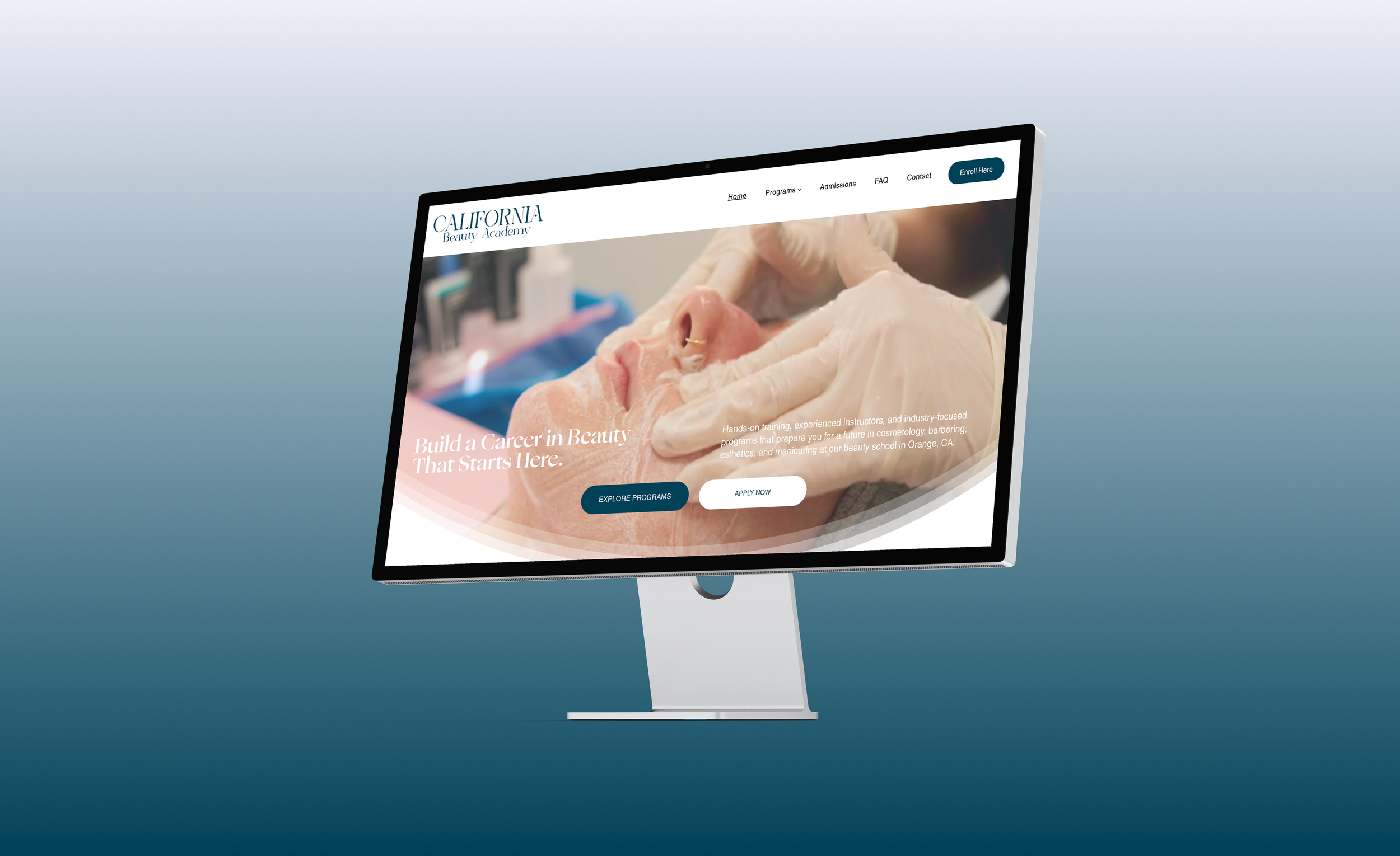
California Beauty Academy needed a website that made its programs easier to explore while creating a more modern and credible first impression for prospective students.
Context
The client wanted to modernize the school’s website and improve how students found information about programs, admissions, financial aid, and enrollment.
Problem
The existing site made it difficult for users to access even basic information. A large header occupied nearly half of the screen, pushing important content below the fold.
The content that followed was also unclear and poorly structured.
Oversized header limited visible content
Important information was buried below the fold
Program details were difficult to scan
Page layouts lacked clear hierarchy
Navigation and calls-to-action were inconsistent
Insight: Users had to work too hard just to understand what the school offered and where to go next.
Research and Approach
I audited the existing site and worked with the client to identify the biggest barriers for prospective students.
Three key issues emerged.
1. Limited Visible Content
An oversized header took up nearly half the screen, pushing important information below the fold.
2. Poor Content Hierarchy
Program and admissions information was unclear, dense, and difficult to scan.
3. Inconsistent Structure
Navigation, layouts, typography, and calls-to-action lacked a clear system.
Old Design
Key Insight
The site’s biggest issue wasn’t a lack of information; it was that the layout and hierarchy made important content difficult to find, scan, and understand.
Information Architecture
Problem:
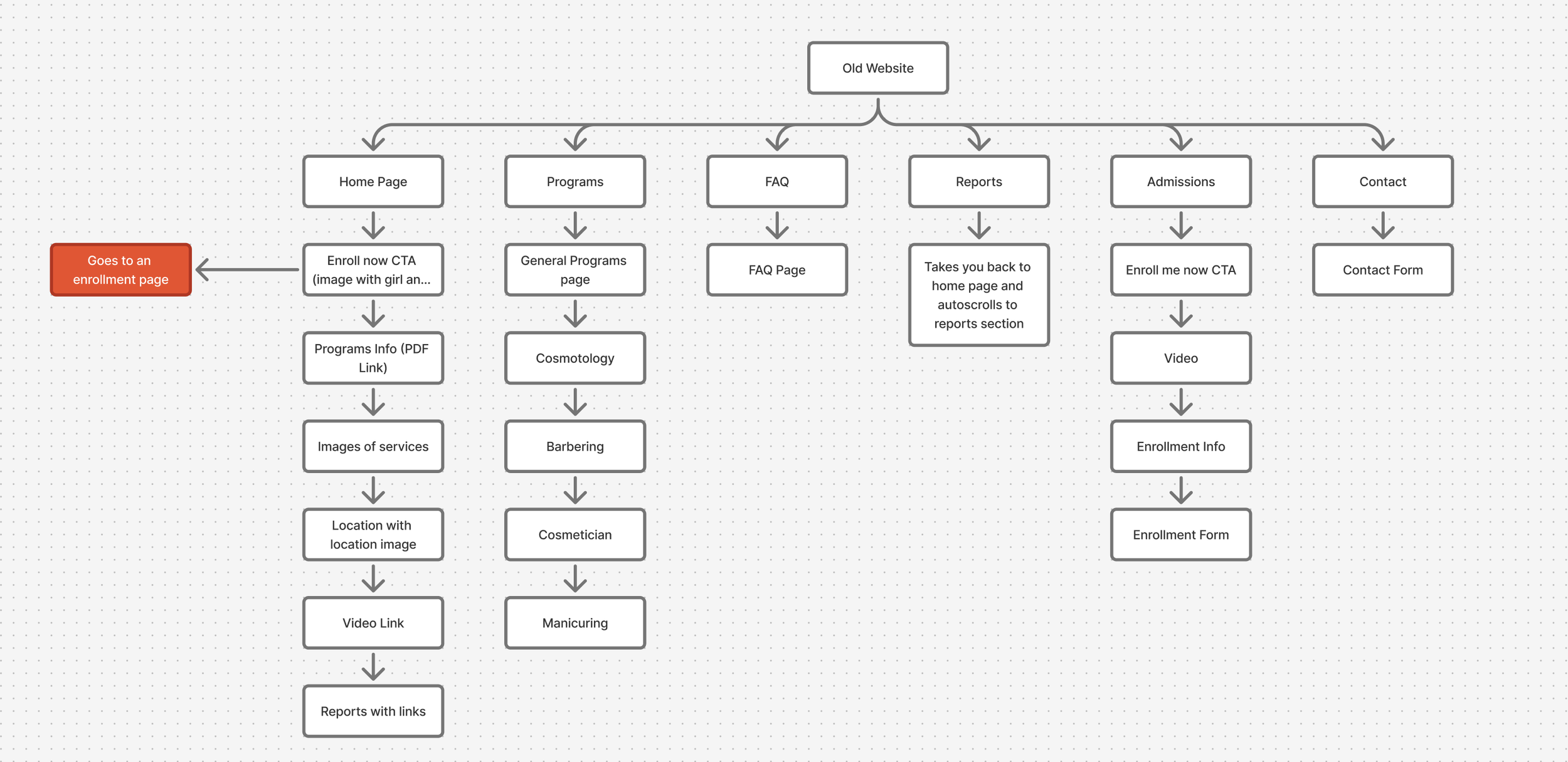
The original site had an inconsistent structure, with important content buried across pages and key actions leading users through unclear or indirect paths.
Solution:
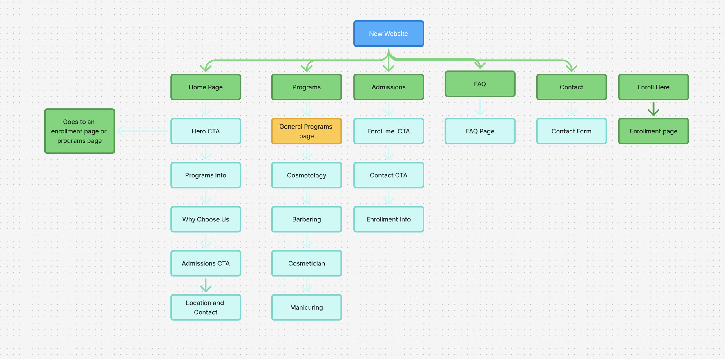
I reorganized the site into clearer page categories and created more direct paths between programs, admissions, contact, and enrollment.
Visual Branding
The original logo felt dated and relied on a low-resolution image that appeared blurry across the site.
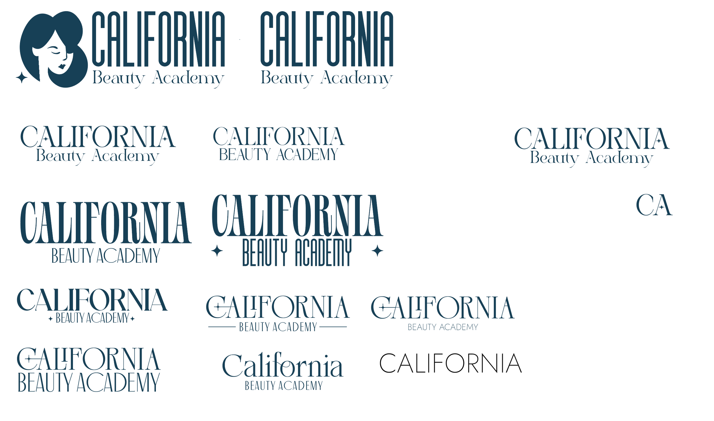
The client wanted a simpler, more modern identity that felt welcoming to a broader audience. I redesigned the logo with a cleaner, more versatile look that could work across both digital and print materials.
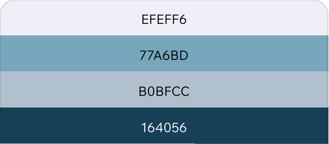
I chose a clean palette centered around dark blue and white, using lighter blues and #EFEFF6 as supporting tones. The blues were selected to reflect the interior wall colors of the academy, helping the website feel more connected to the physical space and overall brand.
Design Decision
For the final logo, I used the Ellana typeface to give the academy a more refined and contemporary identity while keeping the mark simple, approachable, and easy to use across digital and print materials.
Final Design and Solution
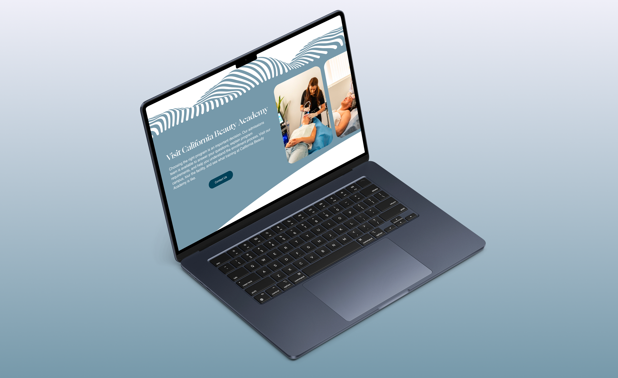
The redesigned site created a clearer, more modern experience that makes it easier for prospective students to explore programs, find admissions information, and move toward enrollment.
Key improvements included:
Simplified navigation and information architecture
Clearer program and admissions content
Stronger visual hierarchy and branding
More prominent calls-to-action
Responsive desktop and mobile layouts
In the first few weeks after launch, the new site reached 522 unique visitors and 637 sessions, compared with 116 visitors and 167 sessions on the previous site from July 1–25.
+350% unique visitors
+281% site sessions
1,733 page views
2m 23s average session duration
The early results show a significant increase in traffic following the redesign while giving prospective students a more direct path from discovering the academy to exploring programs and enrollment.