
DECEMBER 2024 – MAY 2025
UX Audit + Concept Redesign
INTERNSHIP
Group travel planning is messy. The Trip Hub was supposed to simplify it, but users struggled to find the tools they needed.
Context
During my internship at Let’s Jetty, I worked on improving the Trip Hub, the dashboard where users manage group trips.
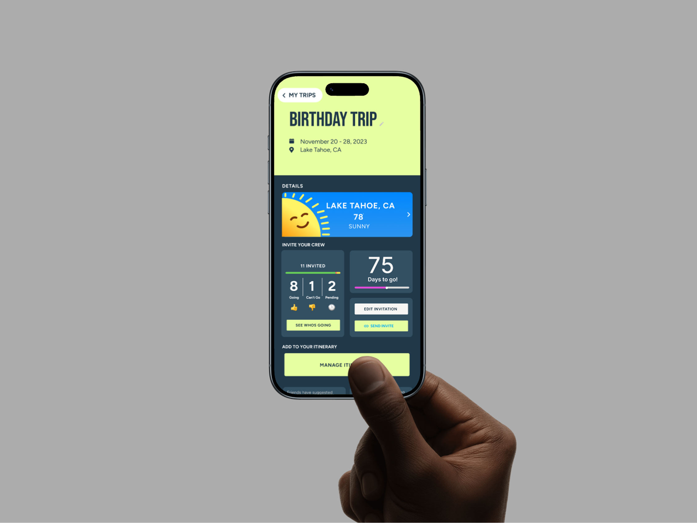
The existing interface contained all the necessary tools but lacked clear hierarchy, causing users to miss important features like sending invites or accessing the itinerary.
My Role
Audit the Trip Hub experience and explore interface redesign concepts that improve feature visibility and usability.
Process
Although the original Trip Hub was colorful and visually engaging, it lacked functional clarity. Key trip planning tools existed, but their placement and labeling made them difficult for users to find.
Two usability issues stood out during the audit.

UX Audit
Issue 1
The “Crew & Invites” section was visually buried within the interface, and its label implied that invites had already been sent rather than prompting users to take action.
As a result, users often overlooked the feature and delayed inviting their travel companions.
Inviting Crew Members Was Difficult
Design Opportunity
Clarify the action and increase its visibility by:
• separating the functionality into two buttons: “Send Invites” and “View Crew”
• or relabeling the button to “Invite Your Crew” to better communicate the intended action
Issue 2
The itinerary feature was placed above the Notes section while related trip actions appeared below it, breaking the visual grouping of trip management tools.
This disrupted the interface flow and made the itinerary harder to locate.
The problem was reinforced visually, most Trip Hub components used colorful tiles, while the itinerary button appeared as a dark element positioned away from the rest of the dashboard.
The Itinerary Was Visually Disconnected
Design Opportunity
Reposition the itinerary alongside related trip tools to improve hierarchy and make it easier for users to find.
Key Insight
The Trip Hub contained all the necessary trip planning tools, but poor visual hierarchy made important actions difficult to discover.
Design Goal
Improve feature discoverability by restructuring the Trip Hub into a clearer, more scannable dashboard.
• surfacing key actions like invites and itinerary
• improving information hierarchy
• grouping related trip tools together
Layout Exploration
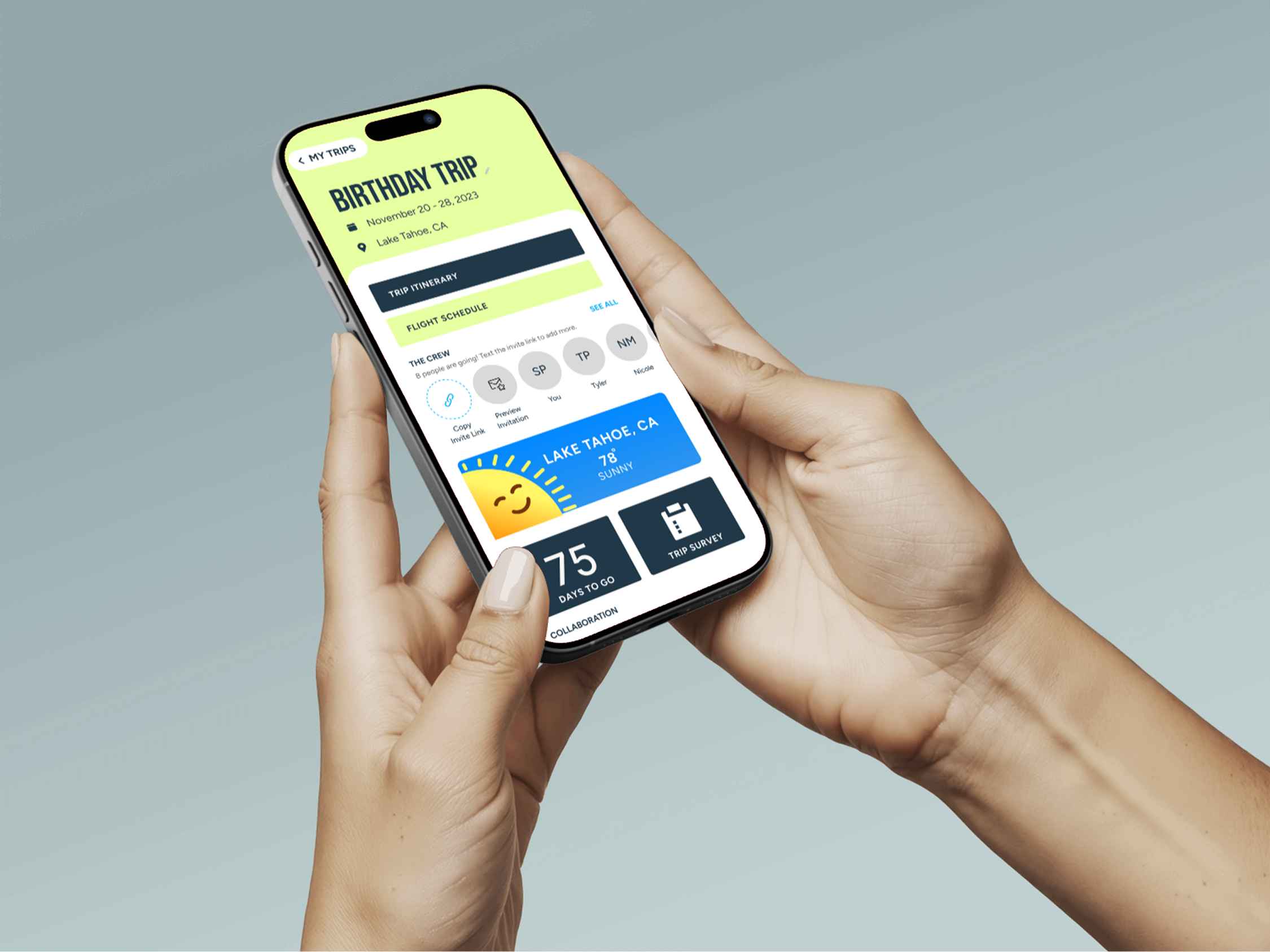
To address these issues, I explored several layout directions for reorganizing the Trip Hub.

Minimal Redesign
✅ - Familiar, Organized Structure
✅ - Improves spacing and visual clarity
✅ - Maintains consistency with the existing interface
❌ - Lacks the colorful and fun branding of the original design
❌ - Key actions (invites, itinerary) remain easy to overlook
Rearranging existing elements while keeping the original structure intact.

✅ - Reduced visual clutter by grouping features into expandable sections.
✅ - Improves spacing and visual clarity
❌ - Adds extra interaction
❌ - Hides important features behind menus
❌ - Reduces immediate scanability of the dashboard
❌ - Important actions become less visible at a glance
Grouping trip features into expandable sections.
Drop Down Tabs

Tile Layout
Organizing tools into modular tiles to increase scannability and surface key actions.
✅ - Maintains the colorful visual identity of the original design
✅ - Clearly groups related trip tools into visual modules
✅ - Improves scanability and hierarchy across the dashboard
✅ - Highlights Core Actions
❌ - Introduces an entirely new layout structure
❌ - Possible overload of information for user
The tile-based layout was selected because it improved scanability while maintaining the colorful visual style of the original interface. By grouping related tools into modular sections, the design makes key actions like inviting crew members and viewing the itinerary easier to find.
Design Decision
Proposed Solution
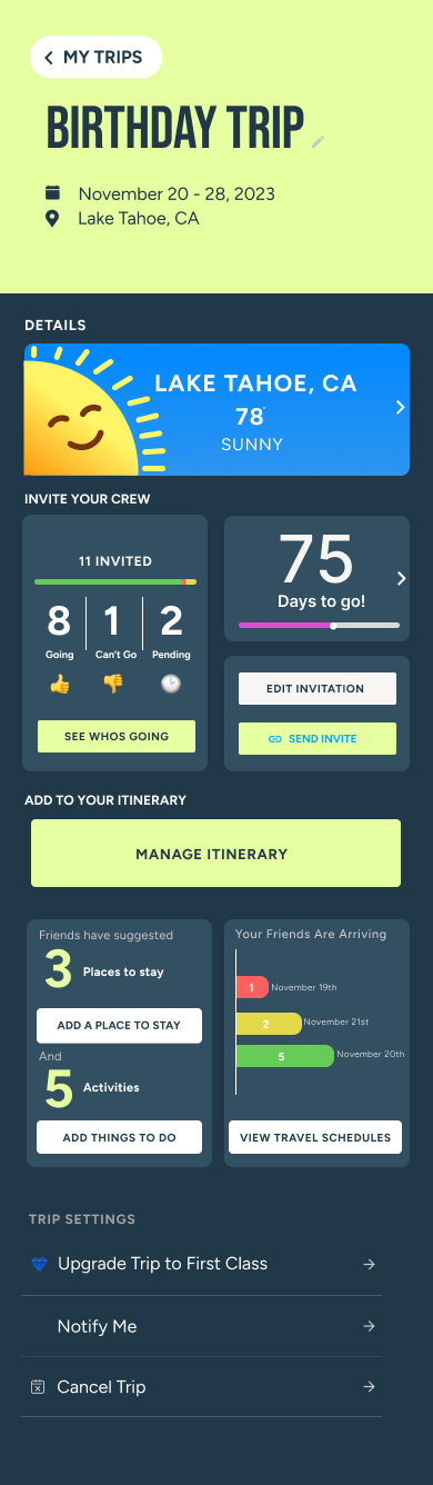
The redesigned Trip Hub introduces a tile-based dashboard that organizes key trip planning tools into clear visual modules.
Actions such as inviting crew members, viewing the itinerary, and managing trip details are surfaced as individual tiles, making them easier to locate at a glance.
This structure improves visual hierarchy and scanability while maintaining the colorful aesthetic of the original interface.
By grouping related features together, the dashboard creates a clearer path for users to manage their trips and complete important planning tasks.
Team Direction
The tile-based concept was well received by the product team and became the preferred direction for reorganizing the Trip Hub.
While this screen represents an early exploration rather than a finalized design, the team began discussing how the modular tile structure could expand to support additional trip planning tools and features.
My internship concluded shortly after this stage, but the concept helped establish a clearer direction for improving feature discoverability within the dashboard.
Outcome + Reflection
Although the redesign was not implemented during my internship, the exploration helped identify key usability issues within the Trip Hub and proposed a clearer structure for organizing trip planning tools.
This project strengthened my ability to audit existing interfaces, translate usability problems into design opportunities, and collaborate with product teams to explore practical UX improvements.