San Diego Design Week 2025
San Diego Design Week annually presents a theme that shapes its visual identity and programming. For 2025, the theme was IMPACT.
As a student living in San Diego, my first thought was the impact humans have on the local environment. As a longtime surfer, I have developed a strong appreciation for the ocean and the natural surroundings that make San Diego unique. I wanted to focus specifically on the environmental pressures affecting our oceans, including pollution, habitat loss, and ecological imbalance.
From there, I developed a visual campaign that used bold imagery, typography, and composition to make these issues feel immediate and difficult to ignore. The final system included a coordinated series of posters and branded assets designed to encourage awareness and reflection. The submission received third place in the San Diego Design Week competition.
Ideation & Exploration
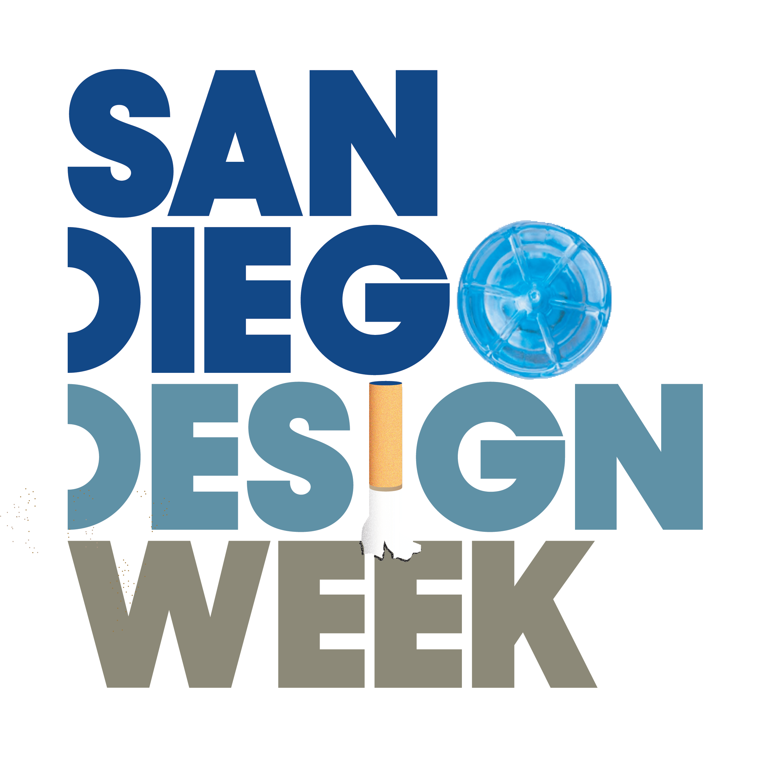
My initial concept used blue tones to reflect the ocean, gradually transitioning into a cloudy brown palette to represent pollution, dirt, and environmental decline. I then explored using discarded materials and pieces of trash to form the lettering, creating a more direct visual connection between the campaign’s message and its typography. This approach helped turn the environmental theme into a cohesive visual system that felt both recognizable and unsettling.
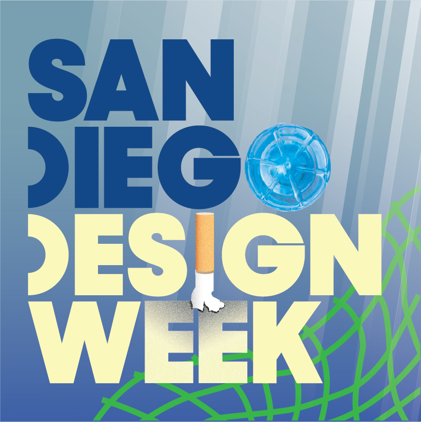
Pivot Point
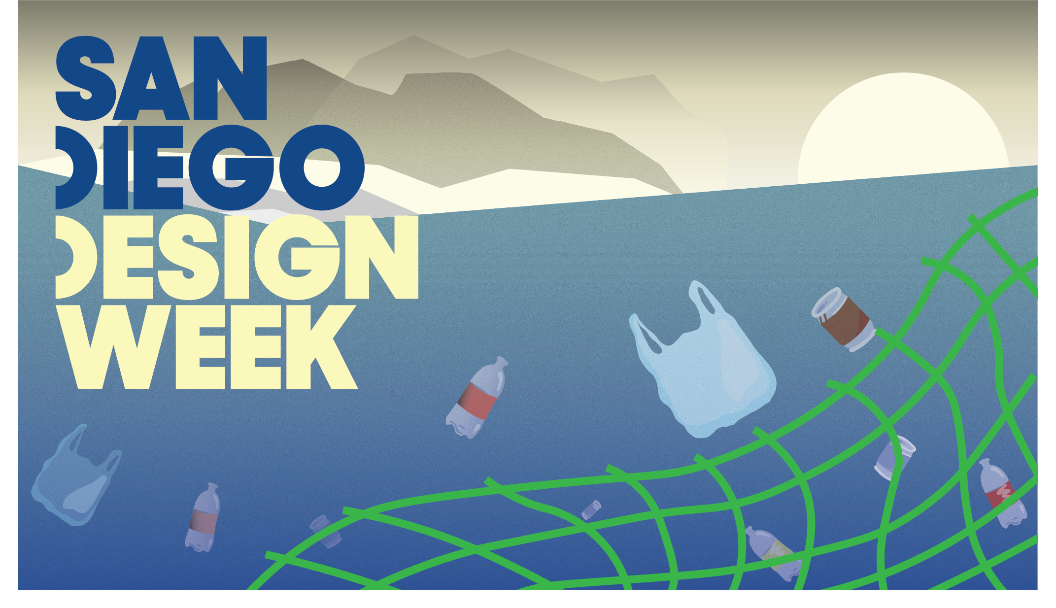
While the initial concept clearly communicated pollution, I felt the visual direction was too literal and visually heavy. The cloudy brown palette and trash-based lettering conveyed environmental damage, but the overall system did not feel as bold, memorable, or adaptable as I wanted.
I began exploring a more brand-driven direction that could still communicate urgency while feeling energetic and visually engaging. This led me toward a duotone system with brighter, more contrasting colors, stronger typography, and a more graphic treatment of the imagery. I carried elements from the original concept into the new direction, including the ocean-inspired palette, environmental subject matter, and contrast between natural beauty and human impact.
Final Visual Direction
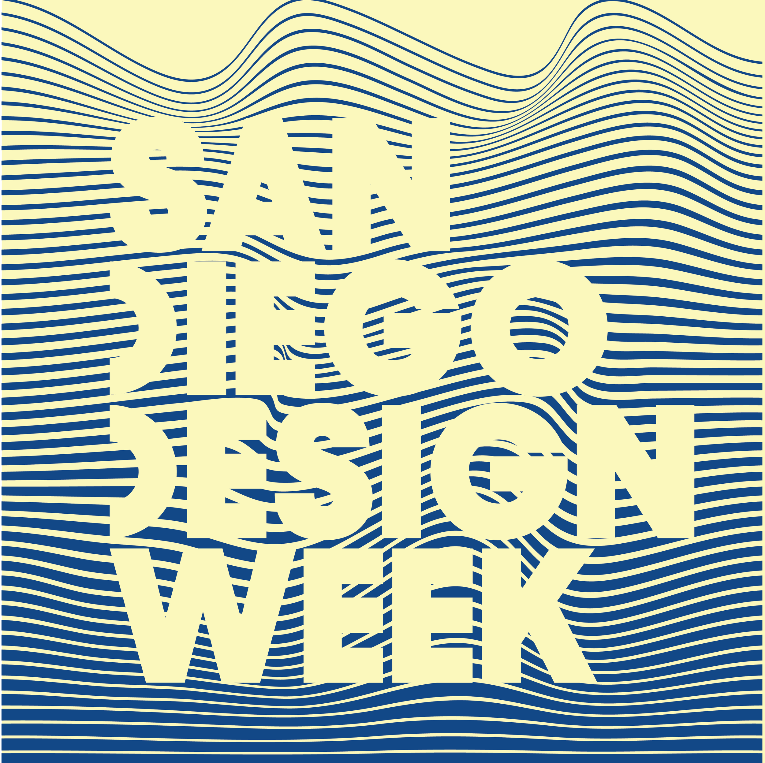
For the final direction, I created a bold duotone system using deep blue and pale yellow. Flowing lines reference ocean currents, while their distortion around trash and marine life shows how pollution disrupts the ecosystem.
Simplified silhouettes and rhythmic linework allowed the campaign to communicate an environmental message while still functioning as a cohesive, recognizable visual identity.
Design Decisions
Color
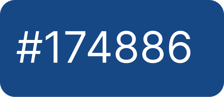
The deep blue references the ocean, while the pale yellow suggests contamination, discoloration, and pollution. Together, the colors create a strong contrast that makes the campaign feel bold and visually distinct.
Linework
The repeated lines mimic waves and currents.
Imagery
Simplified silhouettes make the trash and marine life immediately recognizable without overwhelming the composition.
Composition
The design becomes denser toward the bottom, suggesting the accumulation of pollution beneath the ocean’s surface.

Designing For Impact