
California Beauty Academy
AUGUST 2026
UX/UI DESIGN • WEB DESIGN
Solo Freelance Work
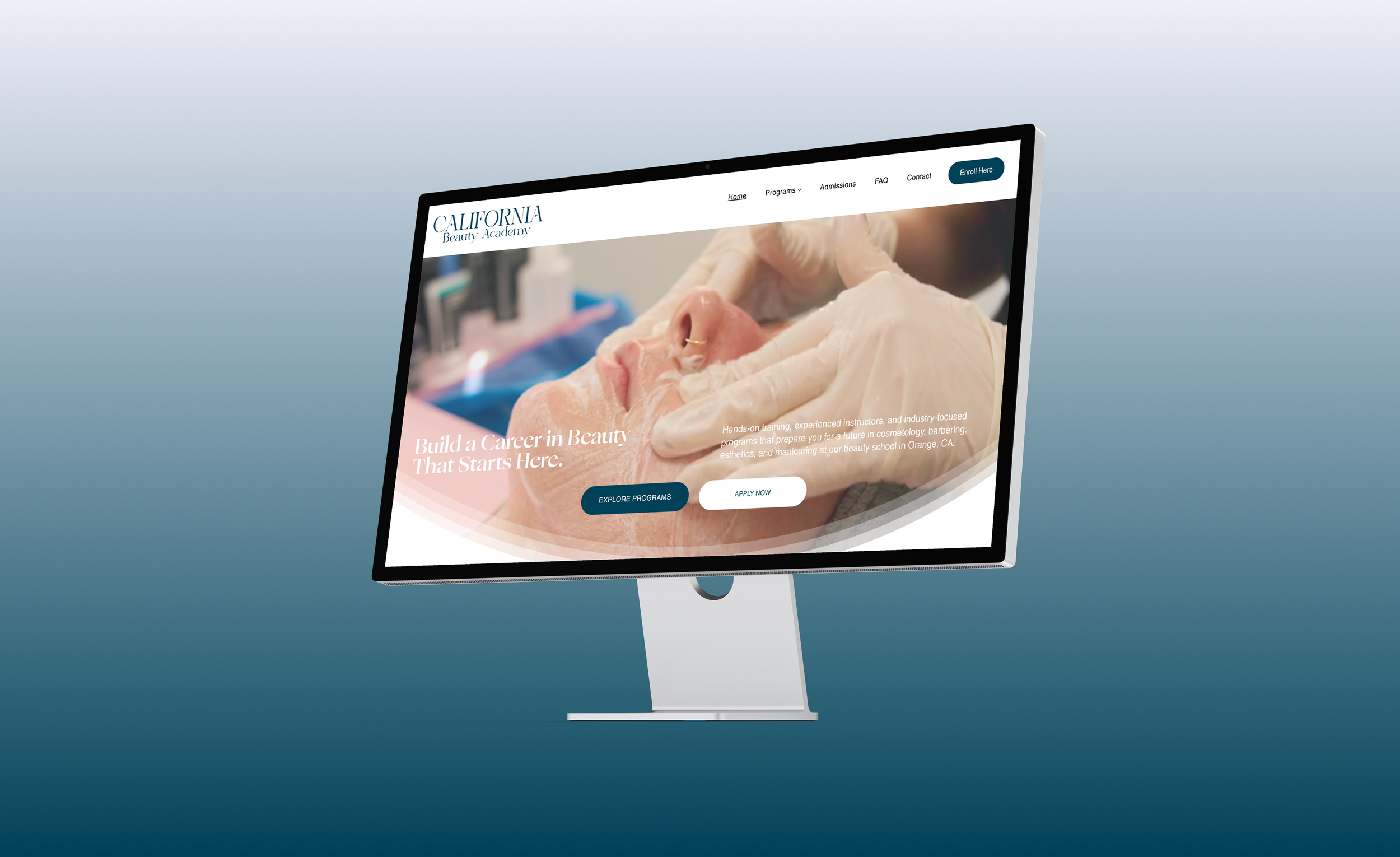
California Beauty Academy needed a website that made its programs easier to explore while creating a more modern and credible first impression for prospective students.
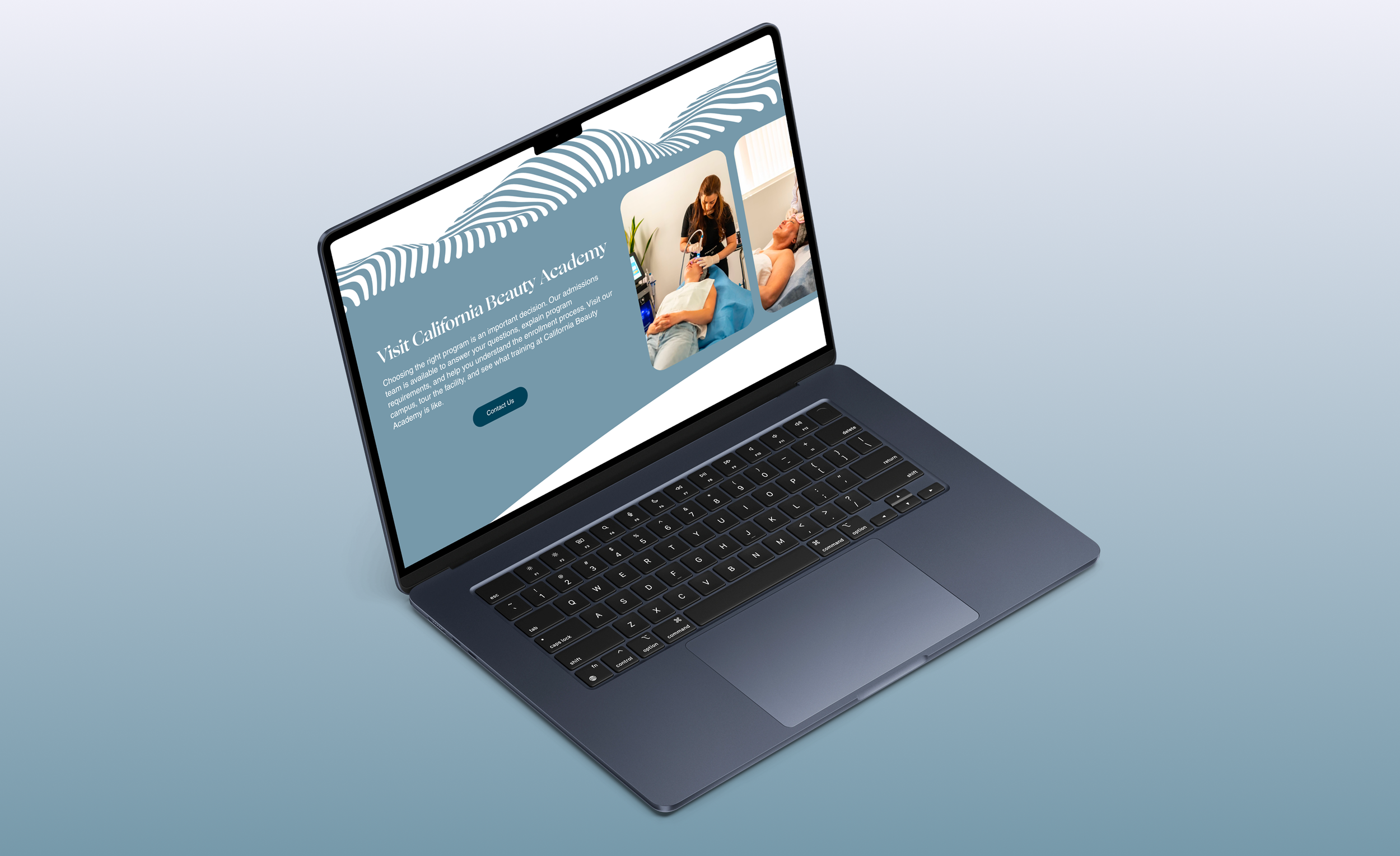
Context
The client wanted to modernize the school’s website and improve how students found information about programs, admissions, financial aid, and enrollment.
Problem
The existing site contained useful information, but inconsistent layouts and scattered content made it difficult to navigate.
Programs were difficult to compare
Admissions information was fragmented
Navigation lacked hierarchy
Visual design felt outdated
Calls-to-action were inconsistent
Insight: The issue was not missing information. It was how that information was organized and presented.
Research and Approach
I audited the existing site and worked with the client to identify the most important information for prospective students.
Three key issues emerged.
1. Fragmented Content
Important program and admissions information was spread across the site.
2. Unclear Navigation
Users needed a simpler path between programs, resources, and enrollment.
3. Inconsistent Visual Design
Layouts, typography, imagery, and spacing lacked a cohesive system.


Old Design Pages
Key Insight
Prospective students needed a clearer path from exploring programs to taking the next step toward enrollment.
Information Architecture
Problem:

Programs, admissions, financial aid, and enrollment content lacked a clear hierarchy.
Solution:
I simplified the site’s structure by introducing a guided Welcome page, separating registration into state-specific flows, and organizing course materials into clearer categories, creating a more intuitive path from landing to certification.

Visual Branding
The original website lacked a cohesive visual identity, which reduced credibility and trust for first-time visitors. As part of the redesign, I developed a consistent brand system to create a more professional and recognizable experience.
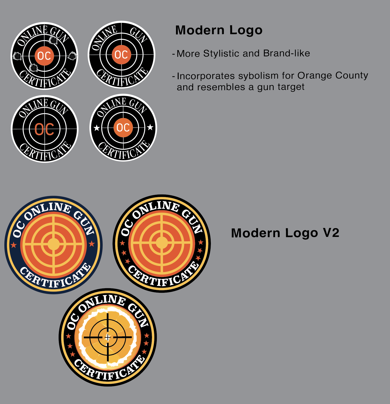
All logo graphics were designed in Adobe Illustrator. I explored several branding directions for the client, ranging from more modern, graphic-driven concepts to simpler marks focused on clarity and professionalism.
These explorations helped establish a visual foundation that aligned with the platform’s purpose while improving the overall perception of the site.


Design Decision
After reviewing the options, the client ultimately chose a minimal text-based logo that aligned with his preference for a straightforward identity. This process highlighted the importance of balancing creative exploration with client goals while still ensuring brand consistency across the website and marketing materials.
Wire-framing and UI Testing
Low-fidelity wireframes mapped out the new information architecture and user flows, focusing on making course registration and navigation more intuitive. After aligning with the client on structure and layout, I developed mid- and high-fidelity mockups that introduced a modern visual style and consistent design system.
To validate design decisions, I conducted basic UI testing by sharing interactive prototypes with the client and selected users. This helped identify areas of confusion, such as unclear button placement and labeling, which I refined in later iterations. By using Figma’s collaborative features, I was able to quickly gather feedback, iterate on designs, and ensure the final product balanced both user needs and client goals.


Final Design and Solution
The redesigned platform created a clearer and more structured user experience.
Key improvements included:
Simplified navigation structure
A more intuitive registration process
Improved visual hierarchy across all pages
Reduced reliance on direct client support
The redesigned platform is prepared to support 700+ new and returning users annually, providing a more streamlined path from registration to certification completion.