
DECEMBER 2025
UX/UI • Product Design • 3D Environment Prototype
Solo Project
People don’t need another screen-time dashboard. They need a place that makes disconnecting feel natural.
Context
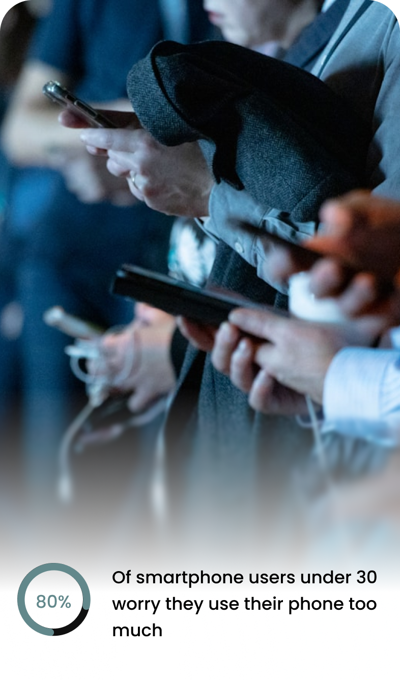
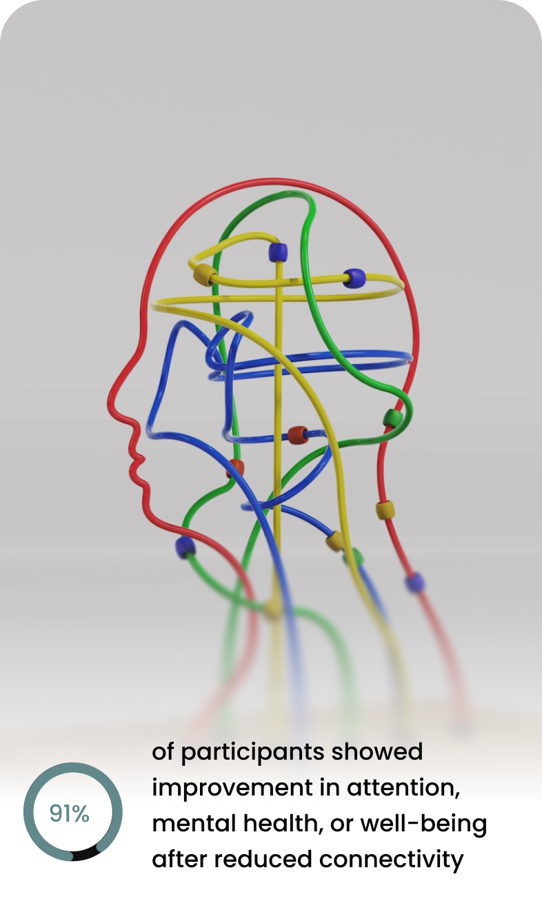
Digital wellbeing tools like Apple Screen Time attempt to reduce our average seven hours of daily phone use, but they often fail because they lack environmental reinforcement and are easy to override. Public spaces rarely support digital boundaries, leaving users to manage distraction alone. OZON3 shifts the focus from device limits to an architectural system that makes physical presence more intuitive and rewarding.
Problem
Despite growing awareness of digital burnout, users:
Struggle to mentally transition out of work mode
Ignore passive digital wellbeing dashboards
Feel guilty when using screen-time limits
Lack dedicated environments for intentional disconnection
How might we design a system that makes going offline feel supported rather than enforced?
Insights

Key Insight:
Users don’t need another screen-time dashboard. They need a physical space that makes disconnecting effortless.
User Personas
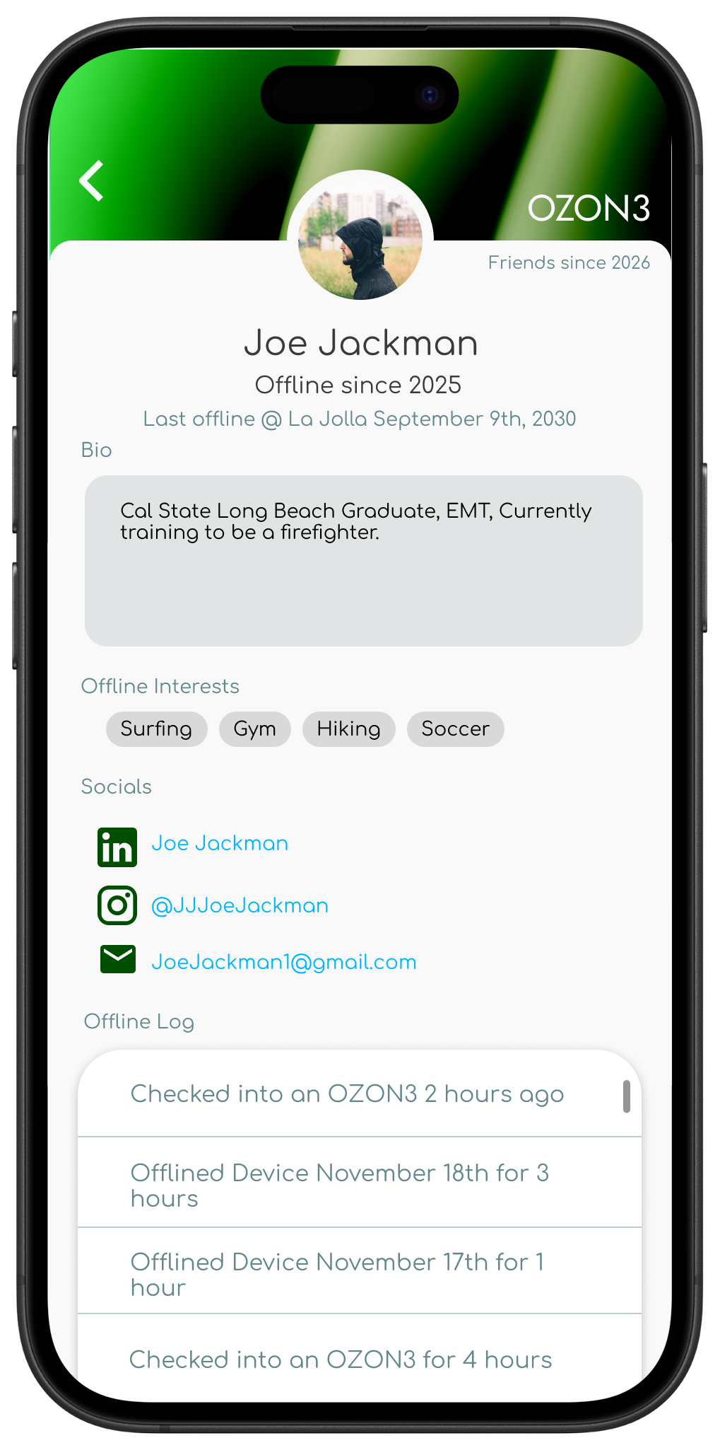
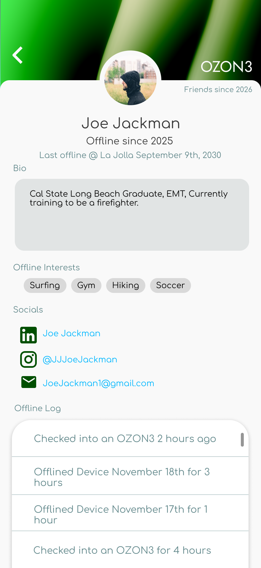
Joe Jackman
Age: 28
Job: EMT
Location: San Diego, CA
“I’m around noise, screens, and alerts all day. I’m looking for a space where I can shut everything off and reset before the next shift.”
Needs
Predictable, calming environments
Relief from constant alerts and noise
Spaces designed for recovery, not productivity
Freedom to disengage without explanation
Goals
Create a consistent post-shift recovery routine
Lower stress and nervous system fatigue after emergency work
Spend intentional time offline without feeling disconnected from others
Improve sleep quality through better wind-down habits
Find spaces designed for recovery, not stimulation
Painpoints
Difficulty mentally decompressing after emergency calls
Adrenaline staying high even after shifts end
Constant alerts and notifications tied to work and training
Irregular schedule that disrupts sleep and routines
Limited access to calm, quiet spaces in the city
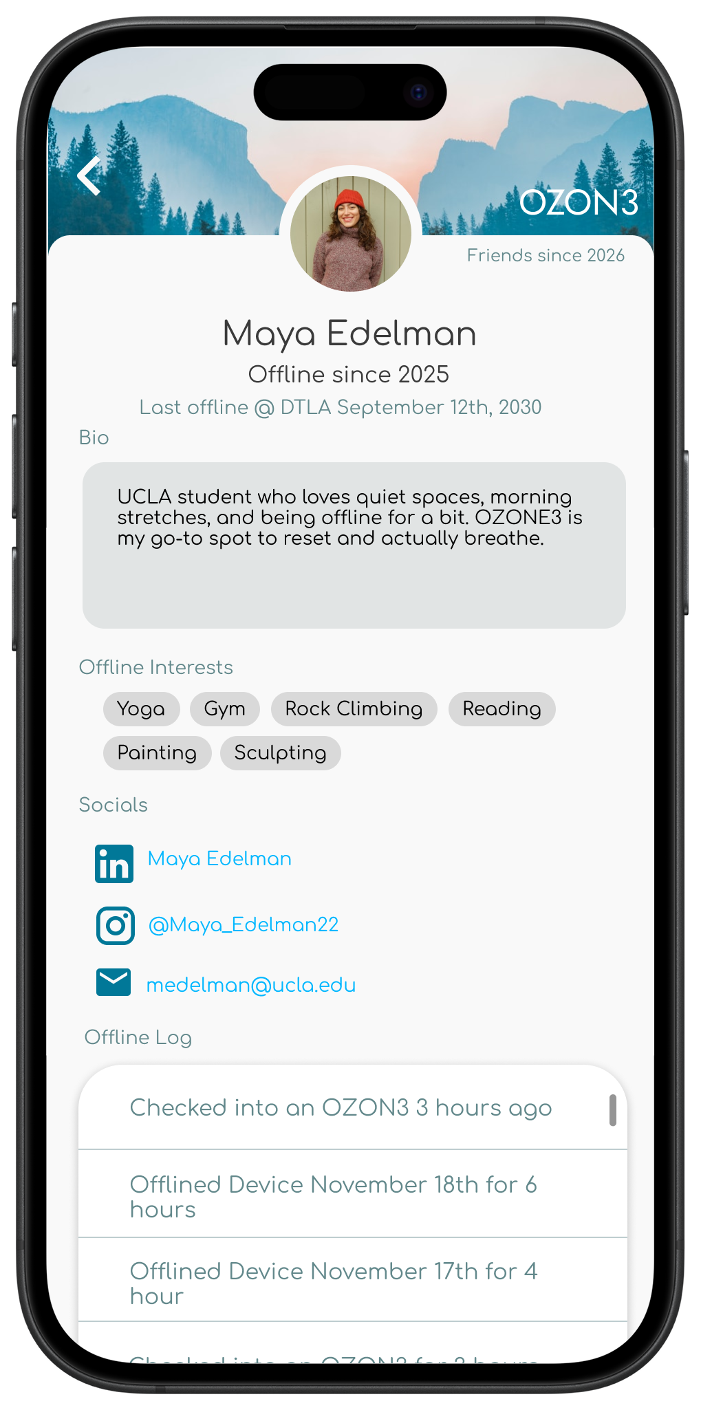
Maya Edelman
Age: 20
Job: Student
Location: Los Angeles, CA
“I’m on my phone and laptop all day for school, so I really value spaces where I can unplug and just be present for a bit.”
Needs
Clear separation between work time and personal time
Environments that support intentional disconnection
Structure that helps transition out of work mode
Goals
Maintain a healthy balance between academic work and personal well-being
Create consistent offline routines during busy school weeks
Reduce mental fatigue from constant multitasking
Find quiet spaces to reset between classes
Support physical and mental health through movement and mindfulness
Stay present without feeling pressure to be productive
Painpoints
Constant screen switching between classes, assignments, and social media
Difficulty fully disconnecting due to school notifications and deadlines
Campus environments that are noisy or overstimulating
Feeling mentally drained even during downtime
Pressure to always be available and responsive
Limited access to calm, affordable wellness spaces
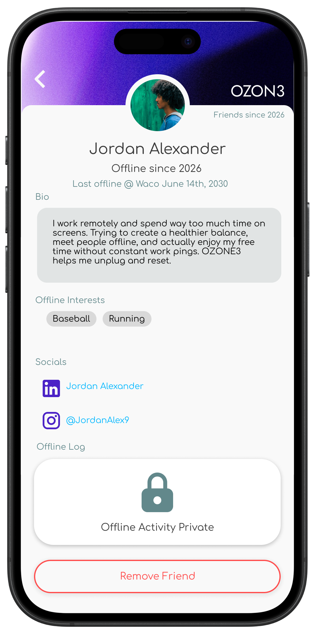
Jordan Alexander
Age: 35
Job: Remote Data Analyst
Location: Waco, TX
Needs
A quiet, low-stimulation environment
Clear boundaries between work and rest
Gentle structure for offline routines
Spaces that feel welcoming, not intimidating
“I work online all day, so I need places where I can fully disconnect and still feel connected to real people.”
Goals
Create stronger boundaries with work notifications
Reduce digital burnout from constant screen use
Spend free time more intentionally
Build a healthier daily routine outside of work
Meet people and engage socially without screens
Painpoints
Always “on” due to remote work expectations
Difficulty mentally clocking out after work hours
Blurred boundaries between home and office
Reliance on passive scrolling to unwind
Feeling isolated despite constant online interaction
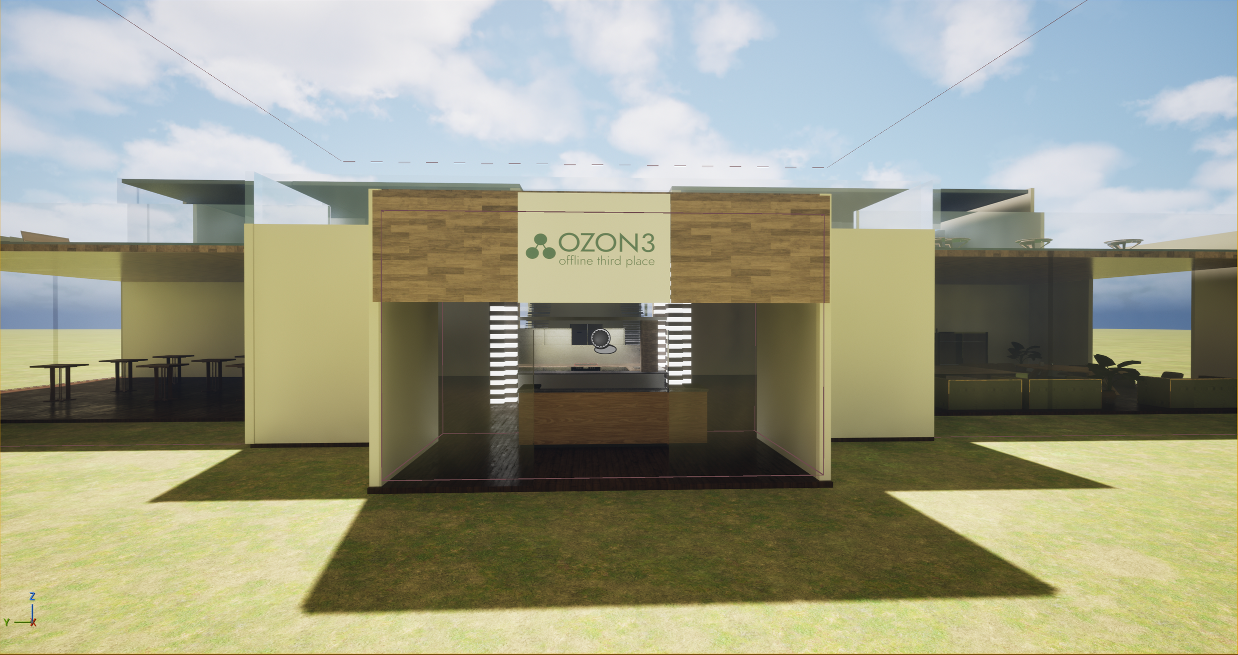
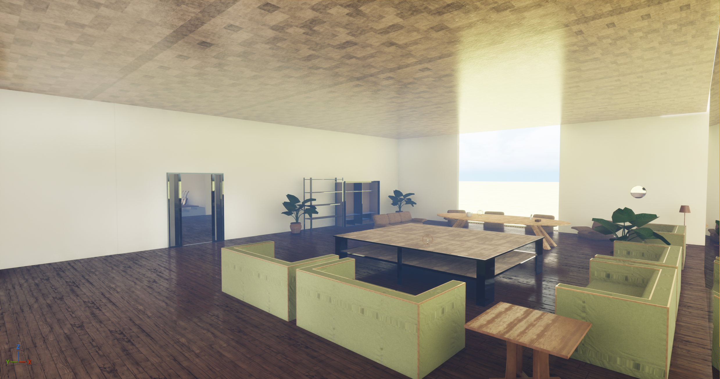
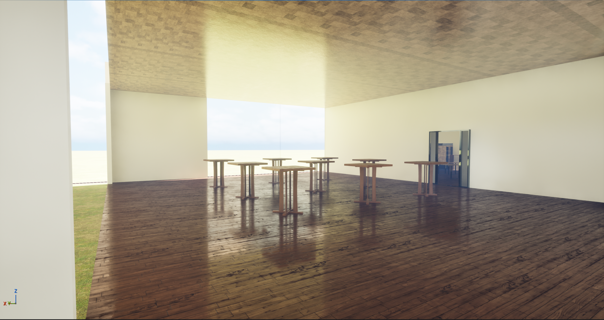
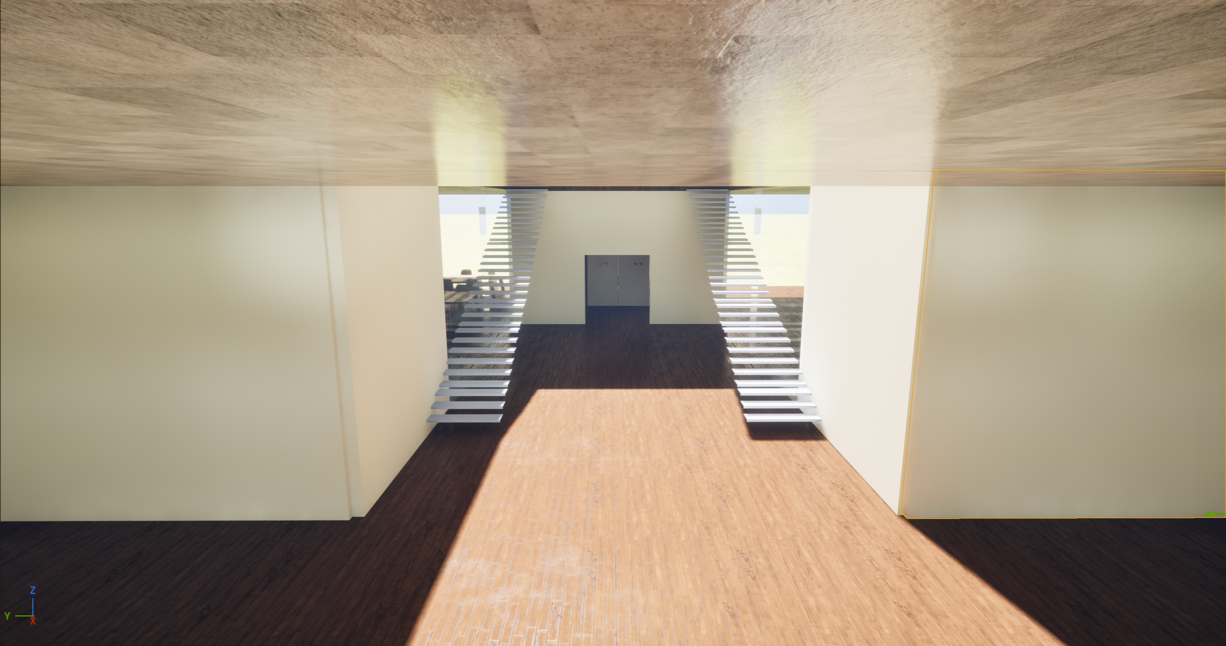
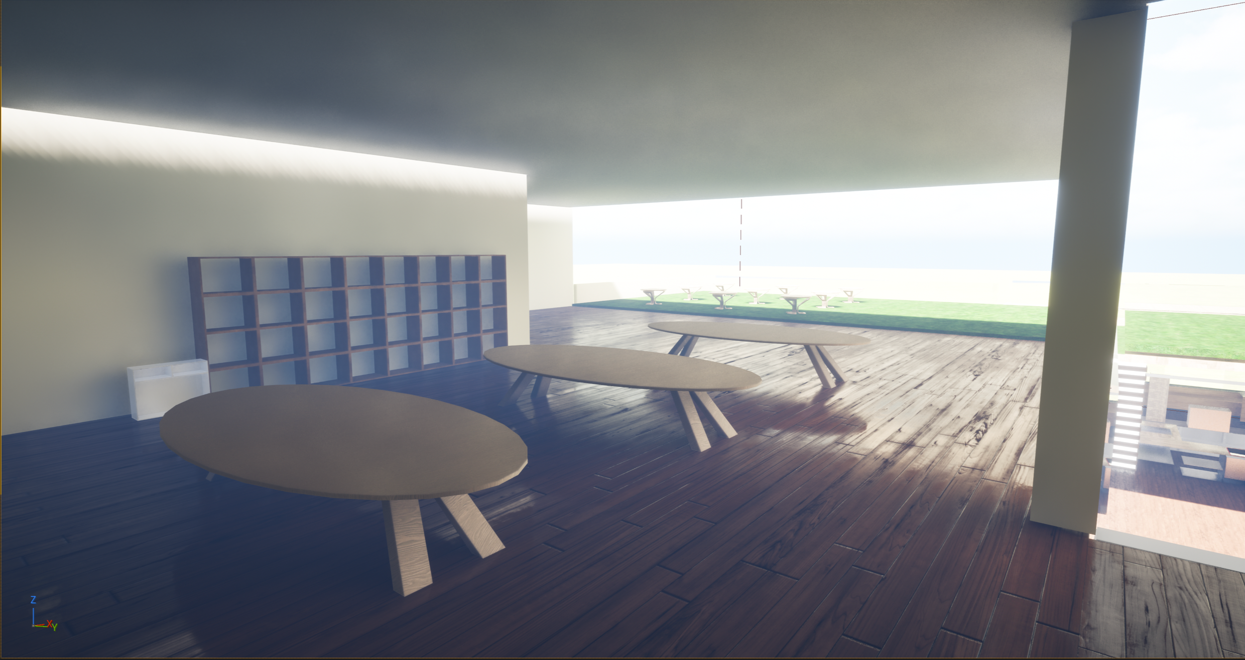
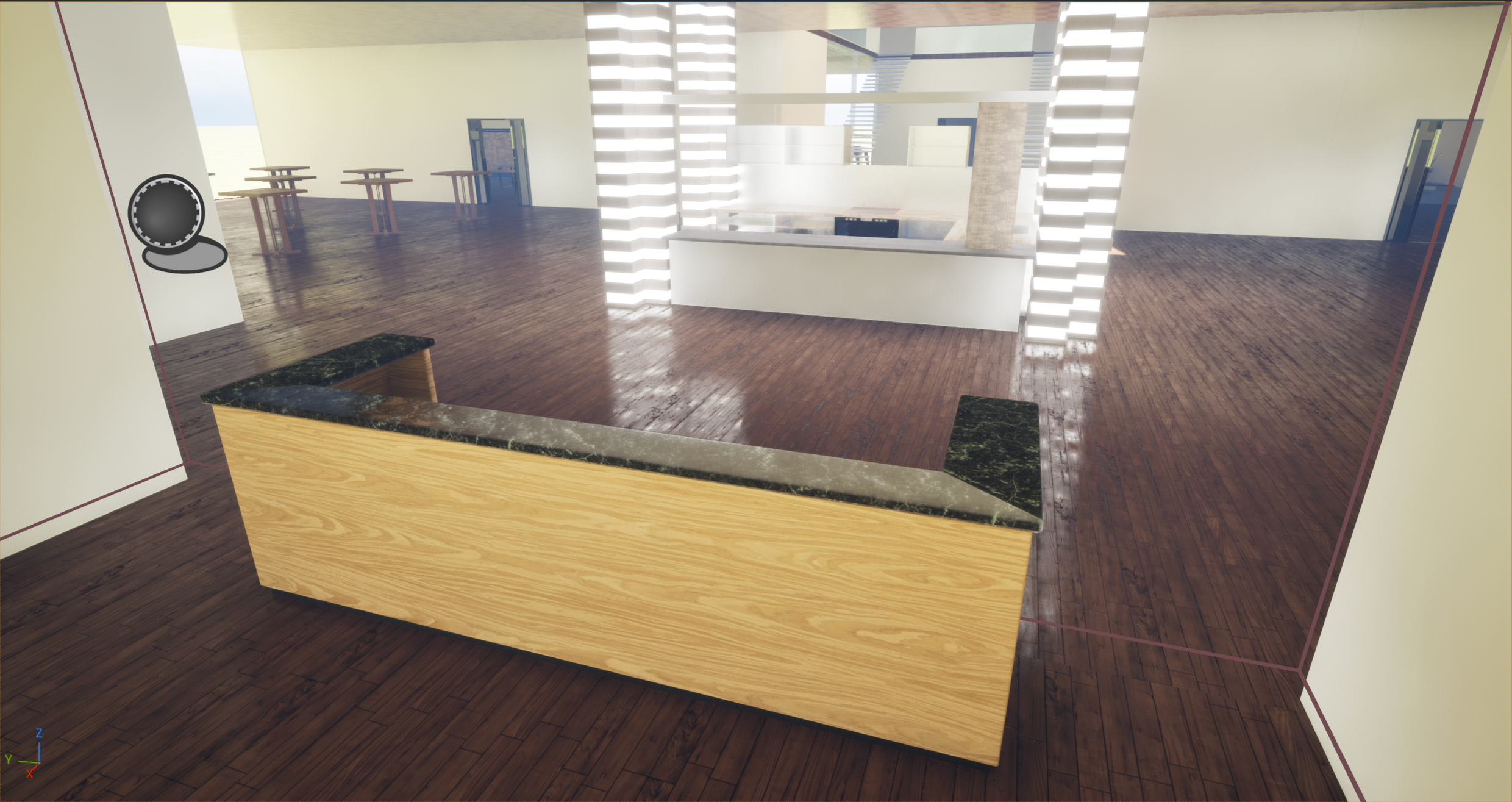
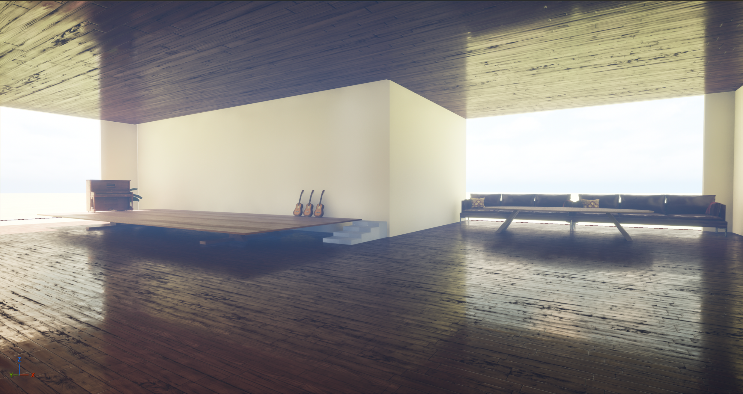
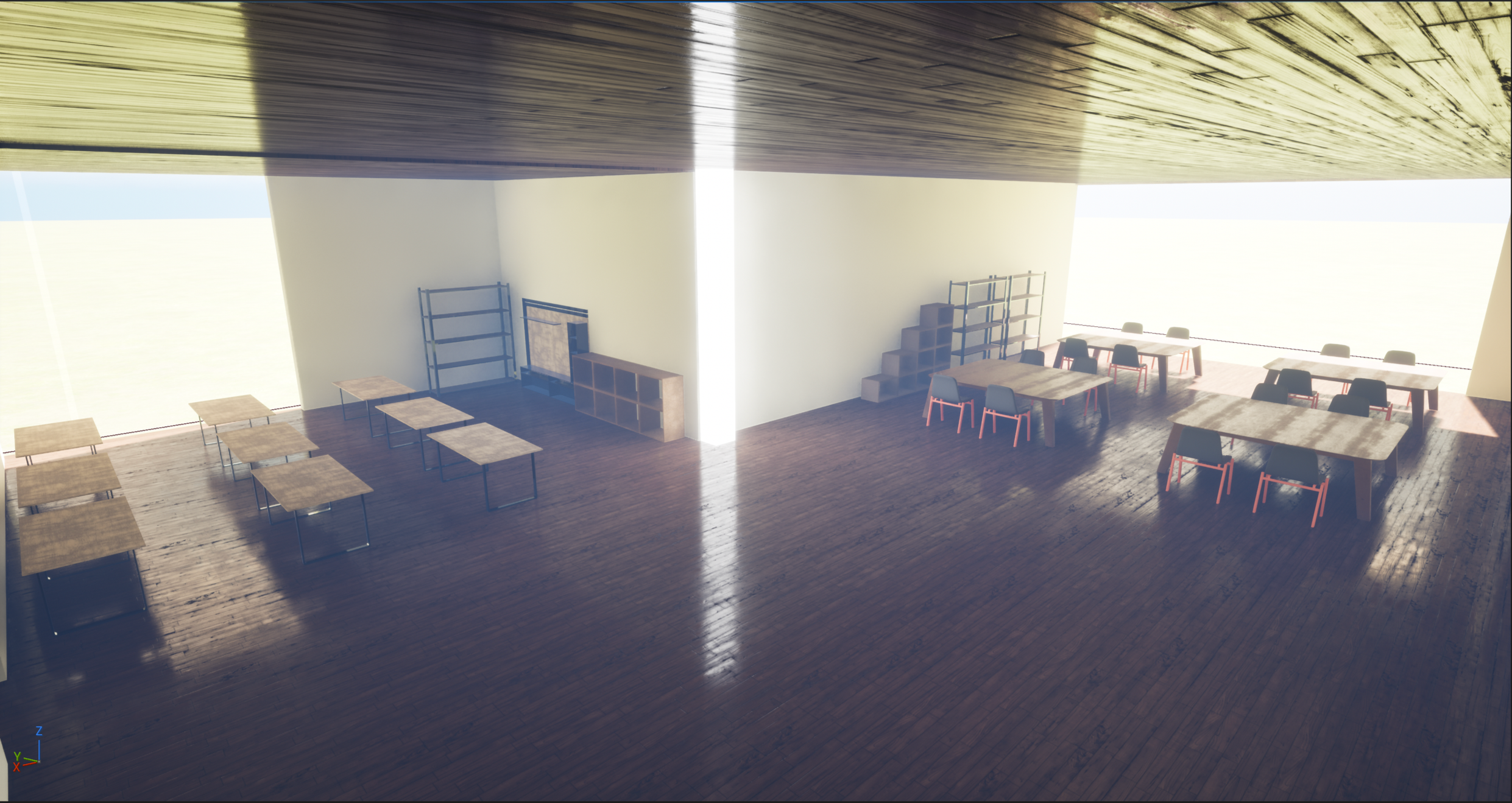
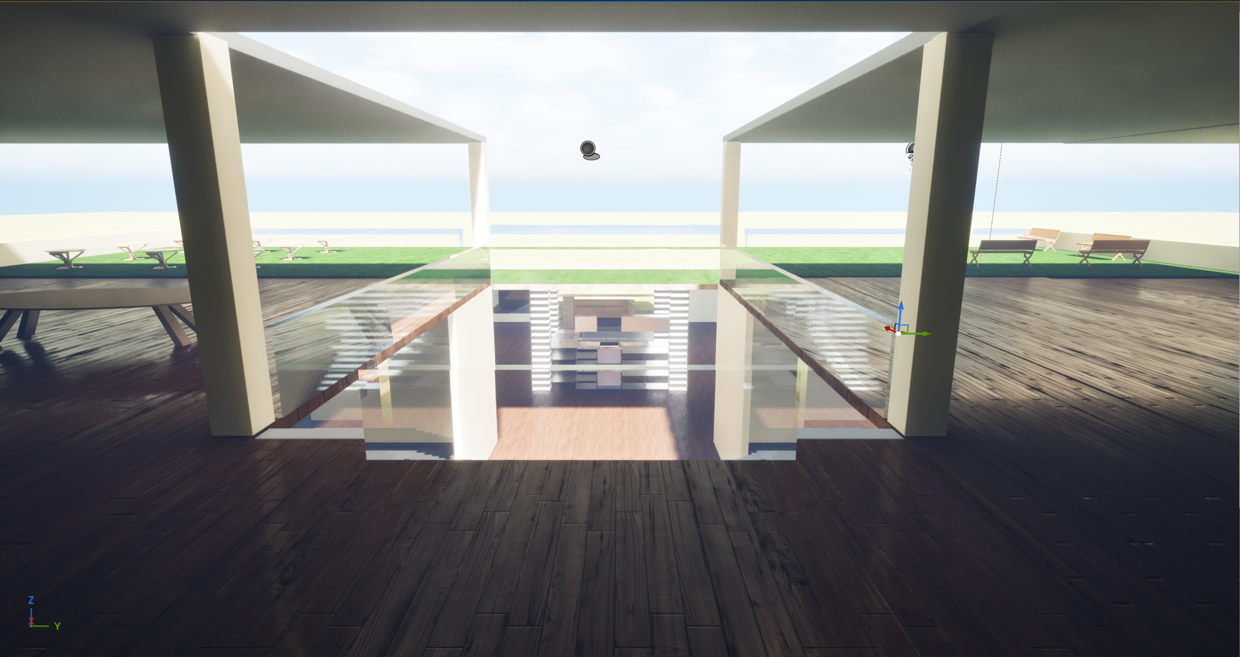
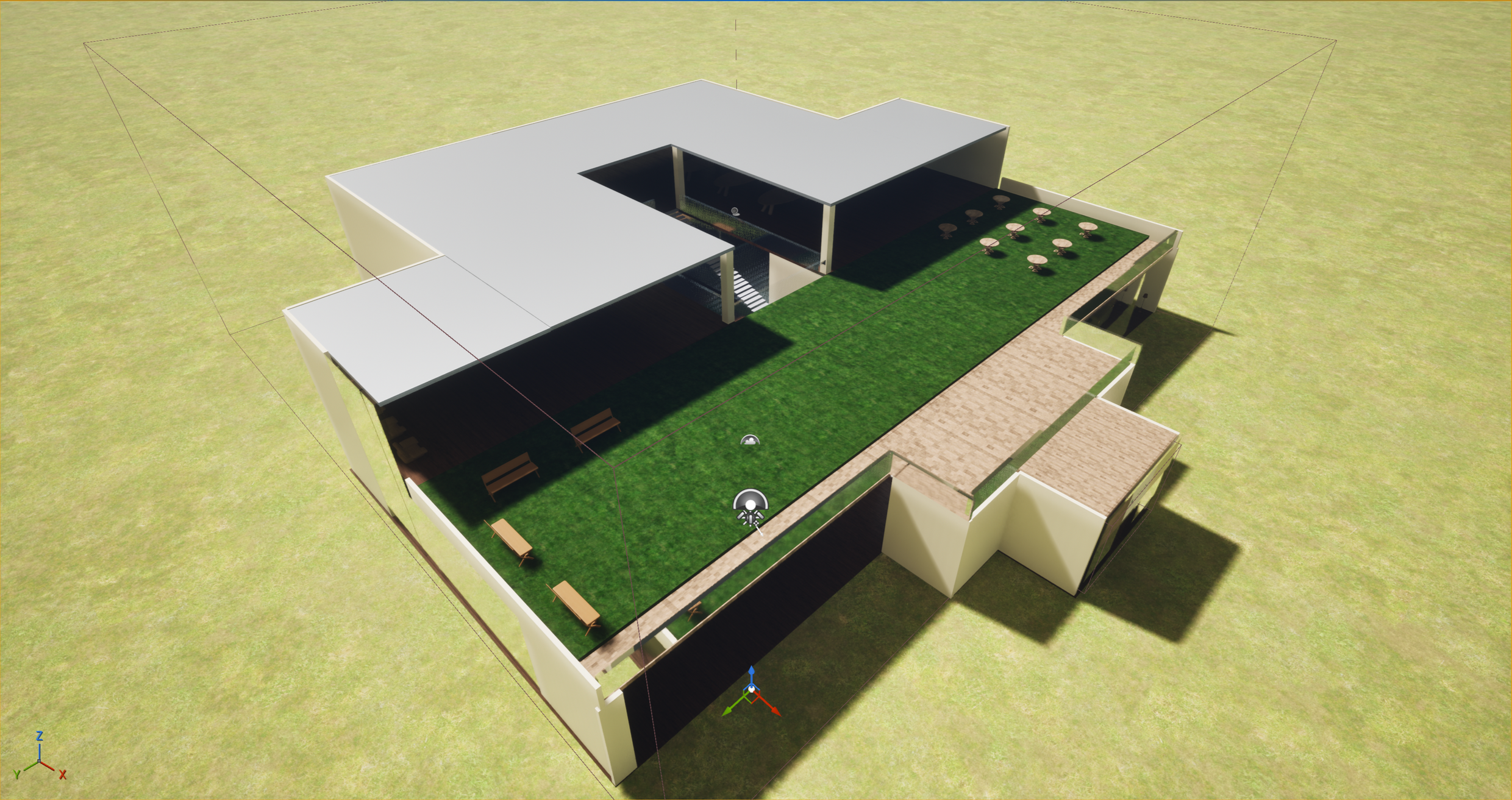
Part One: Prototyping the Physical Experience in Unreal Engine
To bring OZON3 into a tangible experience, I built a fully modeled environment in Unreal Engine as a spatial prototype of an Offline Zone. Using an architectural plan I designed, I translated the layout into a 3D space with areas for entry, community interaction, classes, and restorative activities.
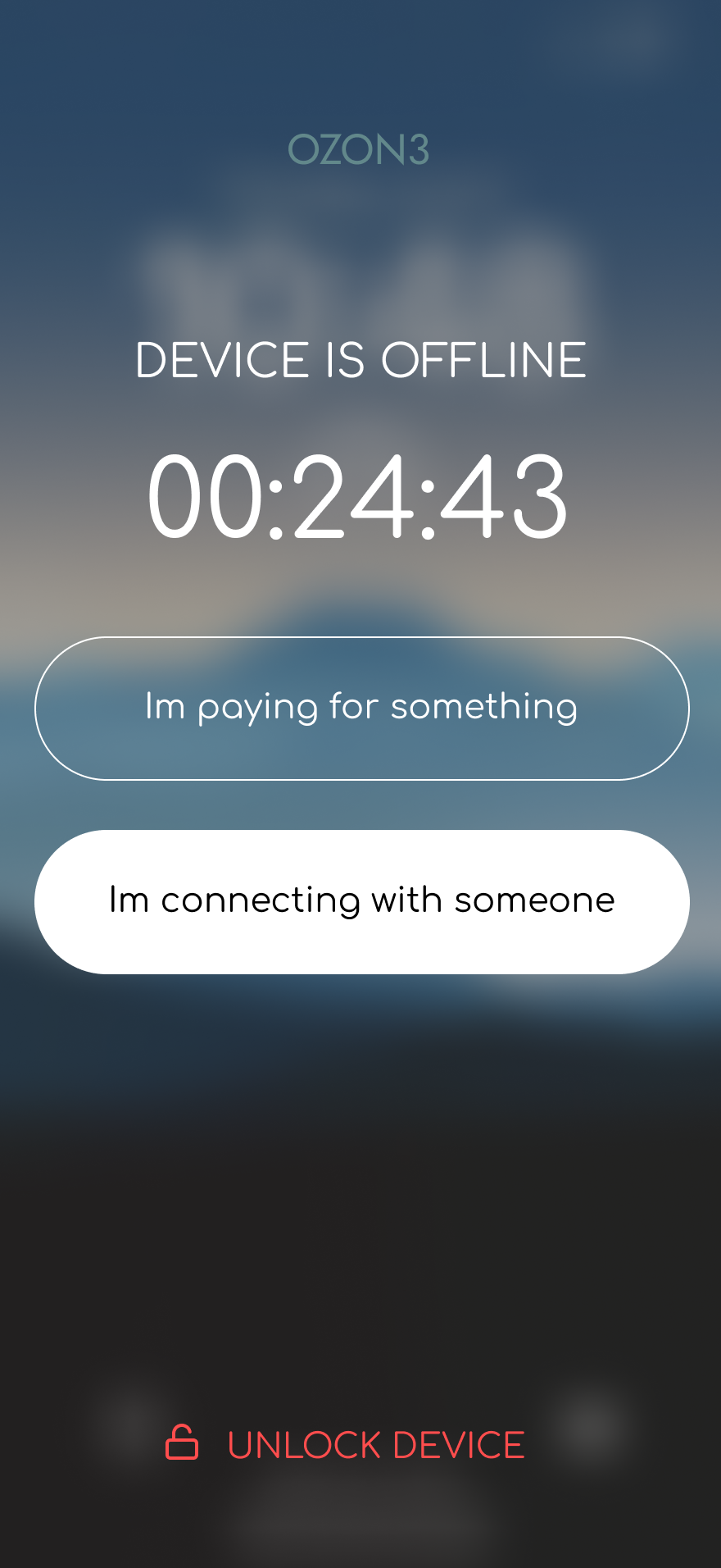
To visualize how devices disconnect in the space, I implemented a trigger system that activates when users cross the entrance boundary. On-screen text displays “offline mode,” while ambient nature sounds fade in, simulating the shift from digital stimulation to a calm, disconnected environment.
This prototype allows viewers to experience the tone, flow, and functionality of OZON3, making the speculative concept feel immersive and real.


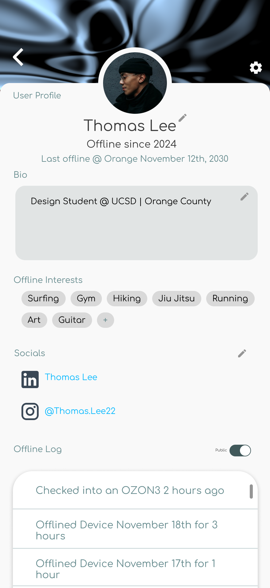
Part Two: Mobile App Product Build
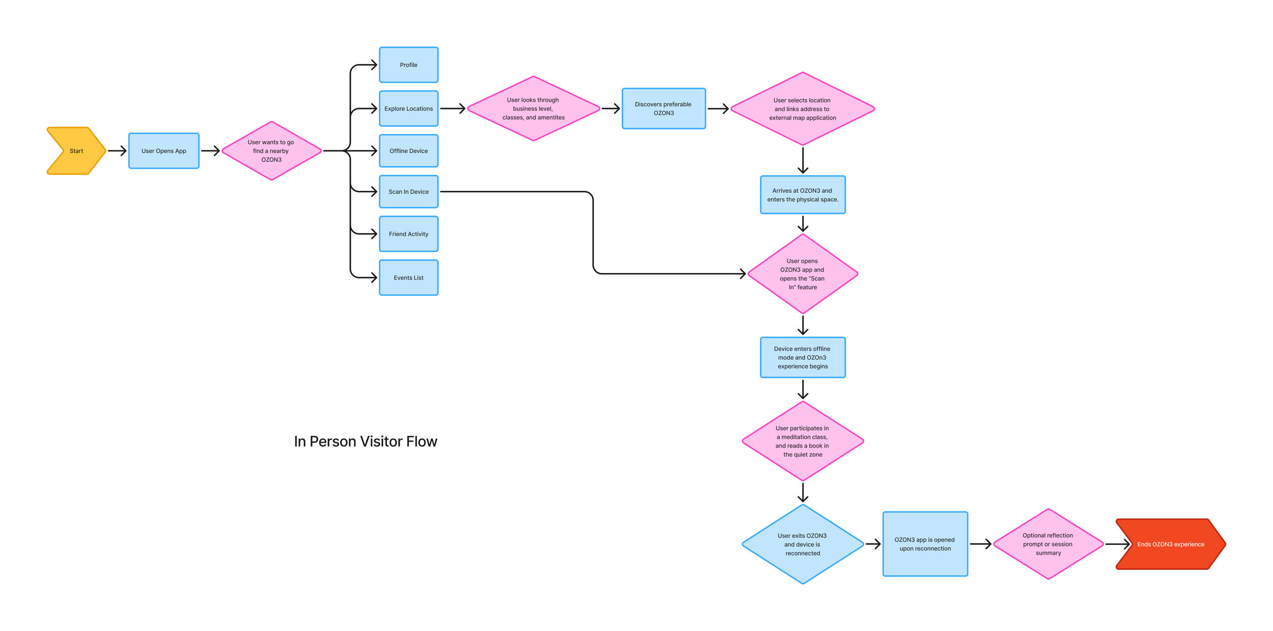
Information Architecture
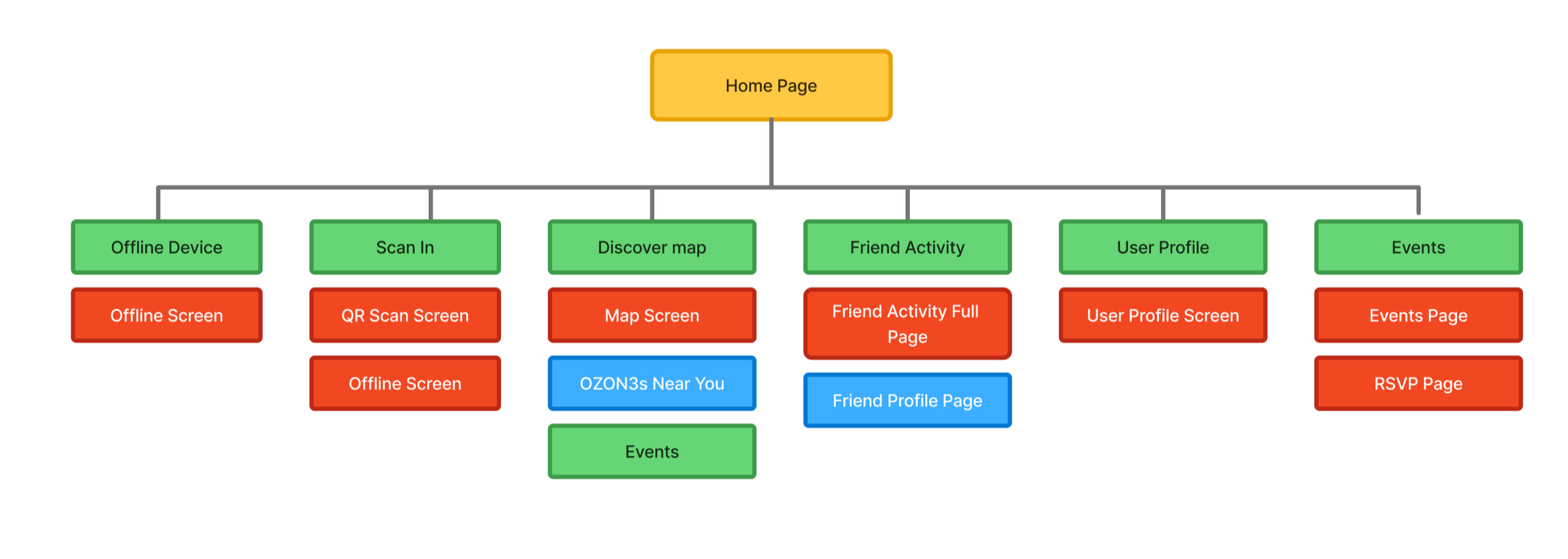
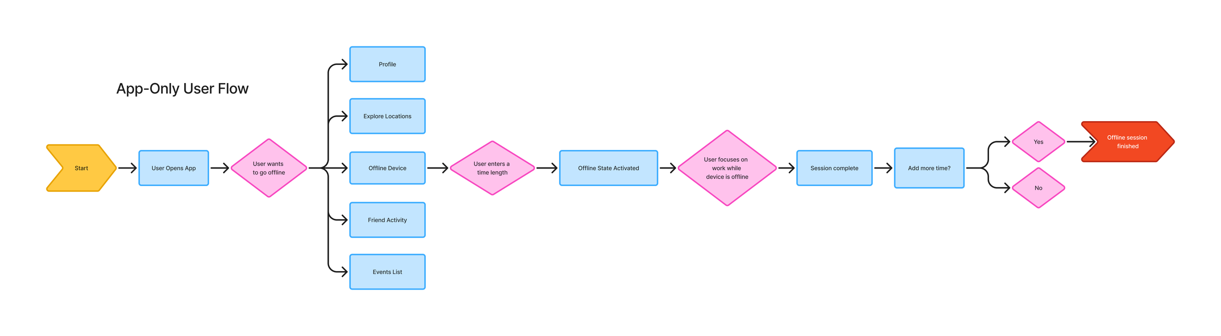
User Flows
Design Process
I focused on the Home Page as the central focus of the application. To determine the most effective way to facilitate this, I developed two distinct conceptual directions to test user motivation and utility:
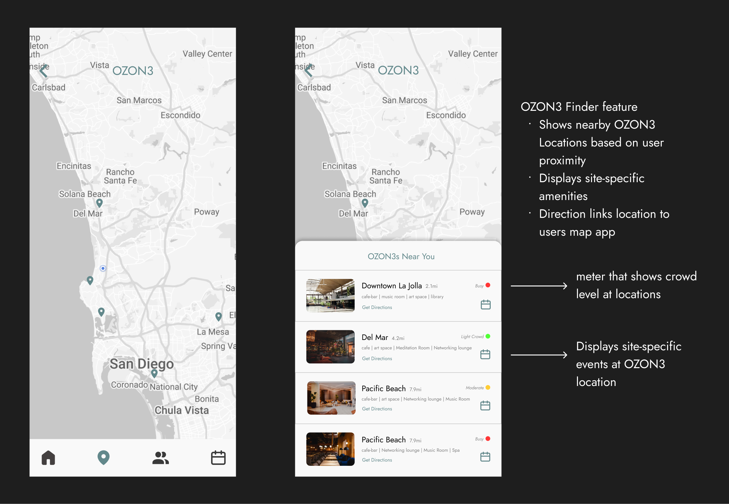
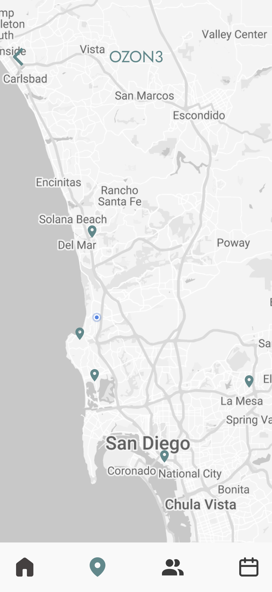
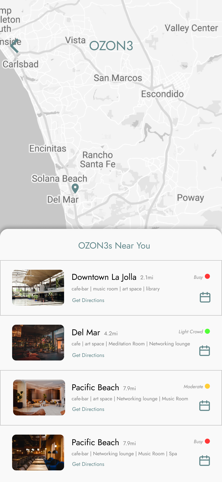
Map-Centric Model
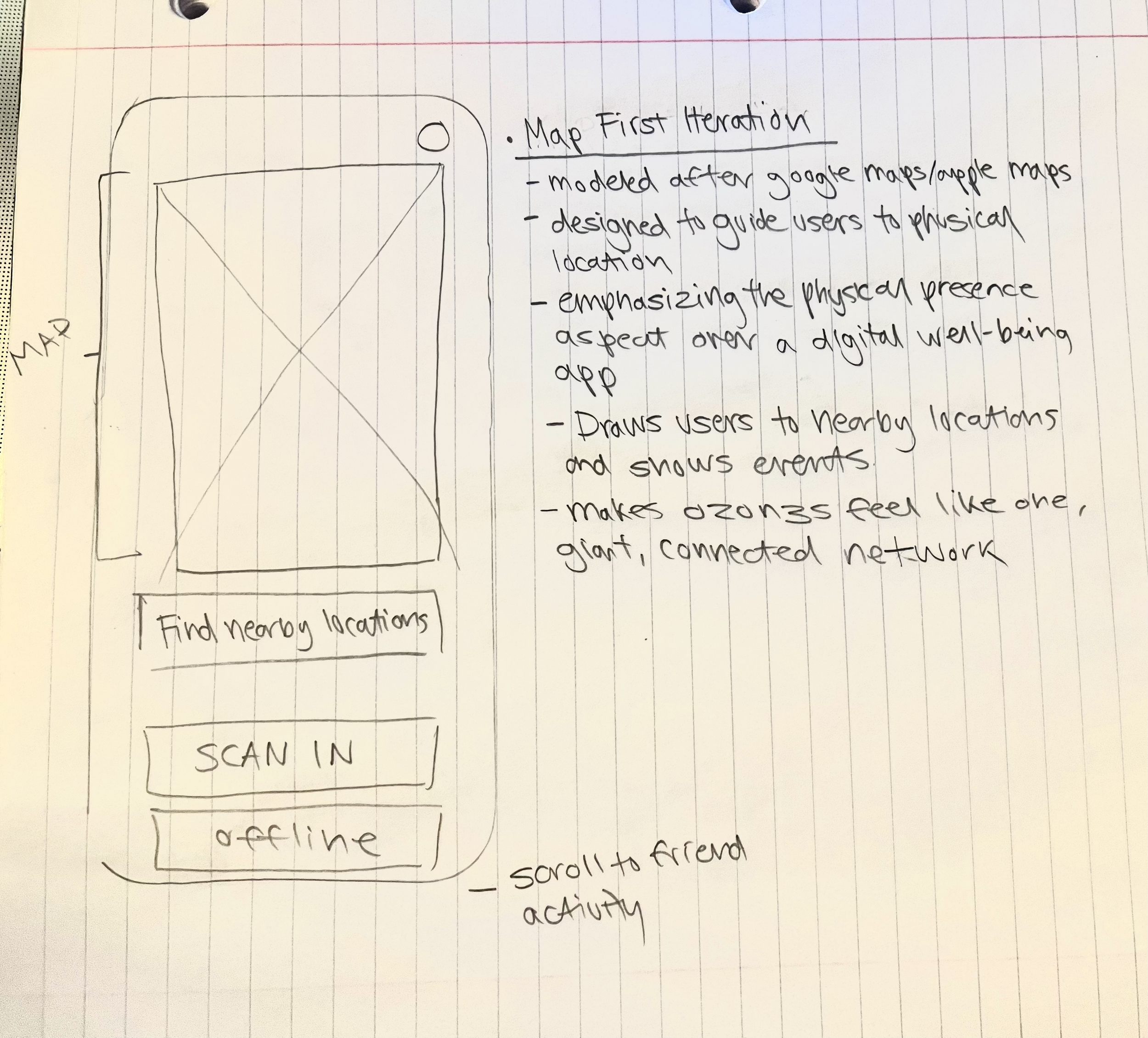
Modeled after navigation tools like Google Maps, this iteration guides users to nearby OZON3 locations. It emphasizes physical presence over traditional wellbeing tracking, framing the system as a connected network of offline spaces across the city.
Metric-Centric Model
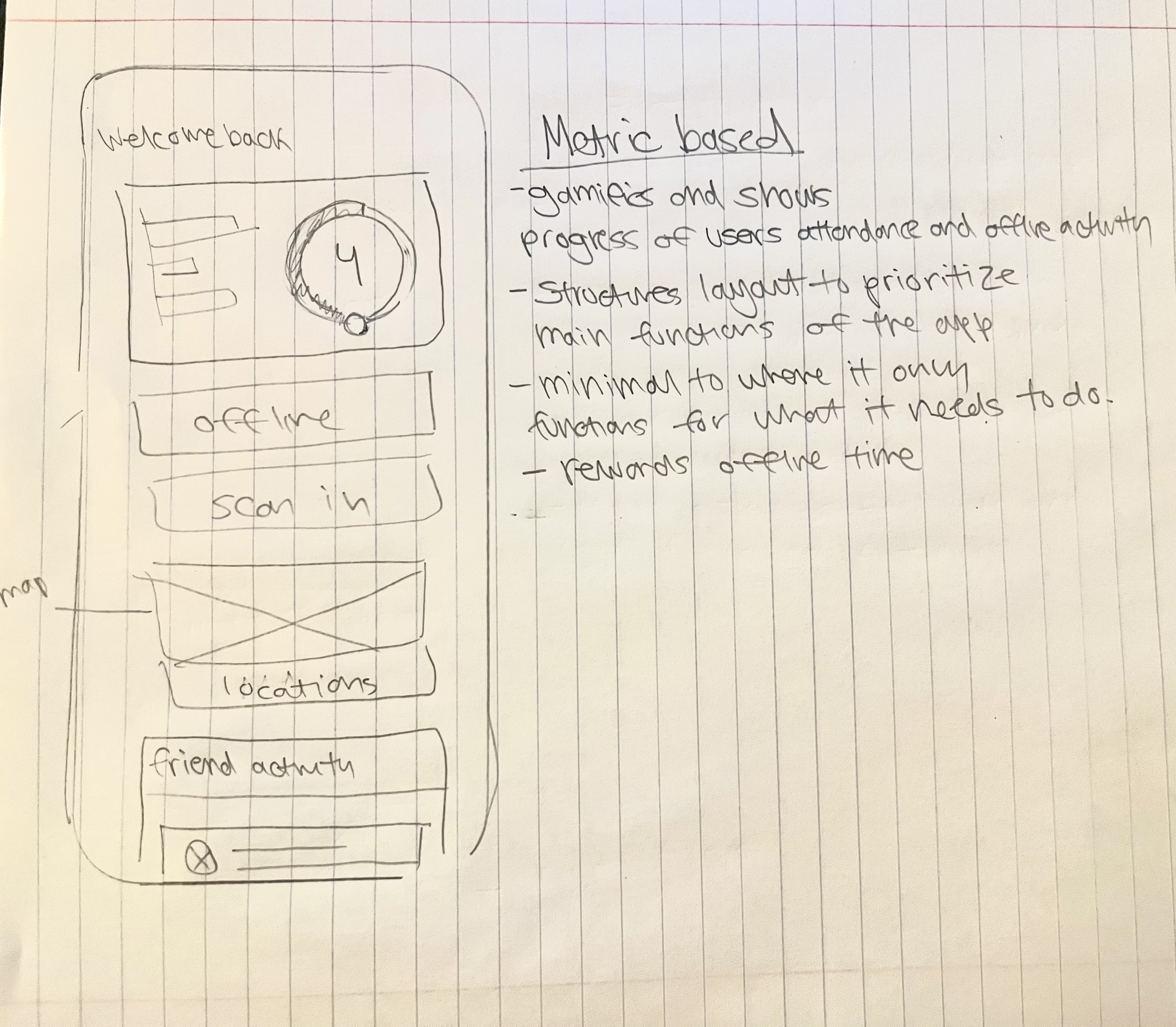
This layout uses gamification to track attendance and offline activity. Designed to be minimal, it prioritizes essential functions while rewarding consistent offline time and personal progress.
Design Decision
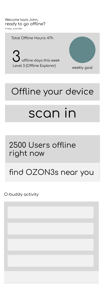
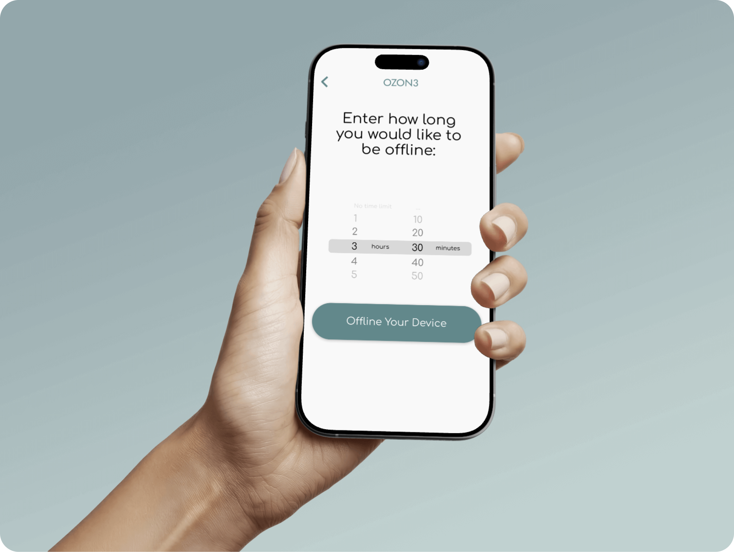
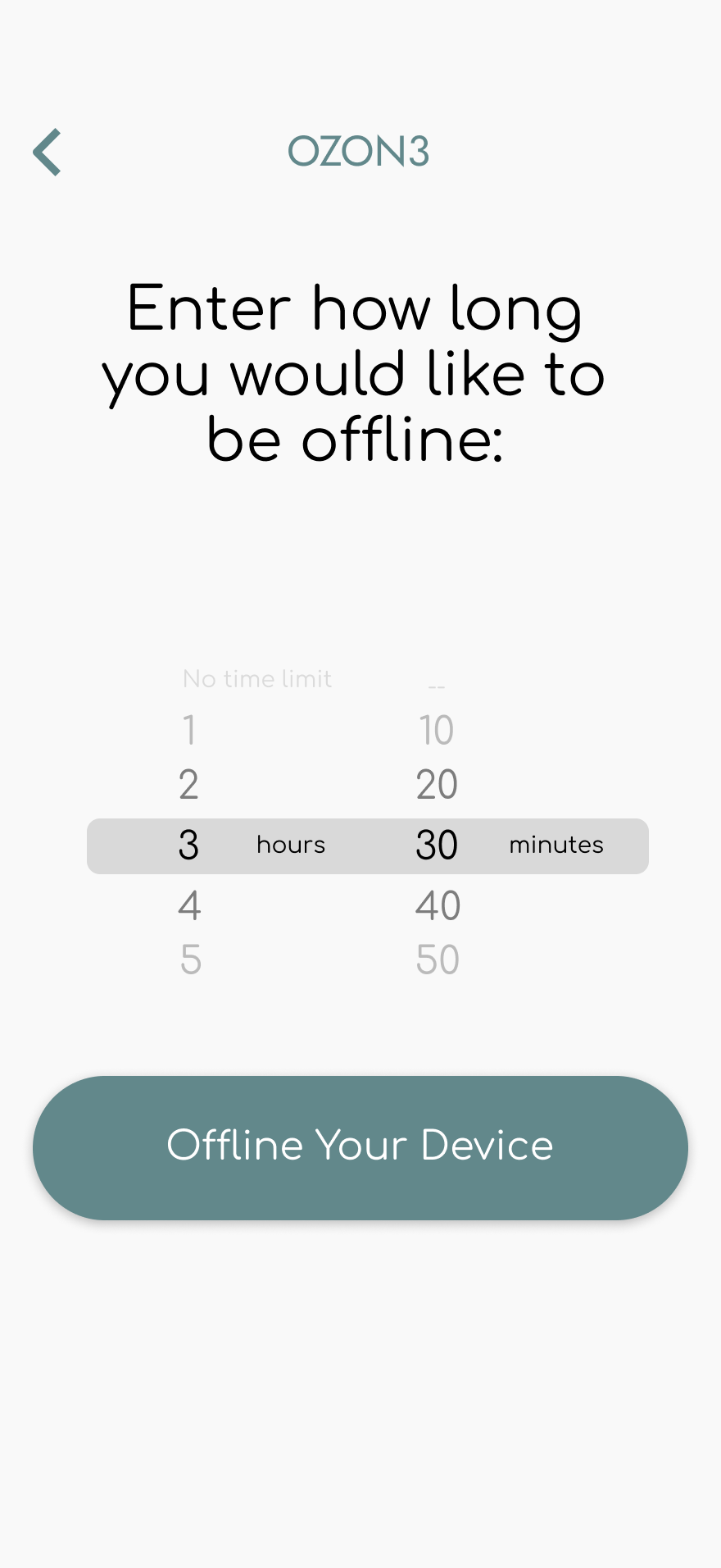
I chose the Metric-Based layout to prioritize habit formation and efficiency through a streamlined, vertical hierarchy:
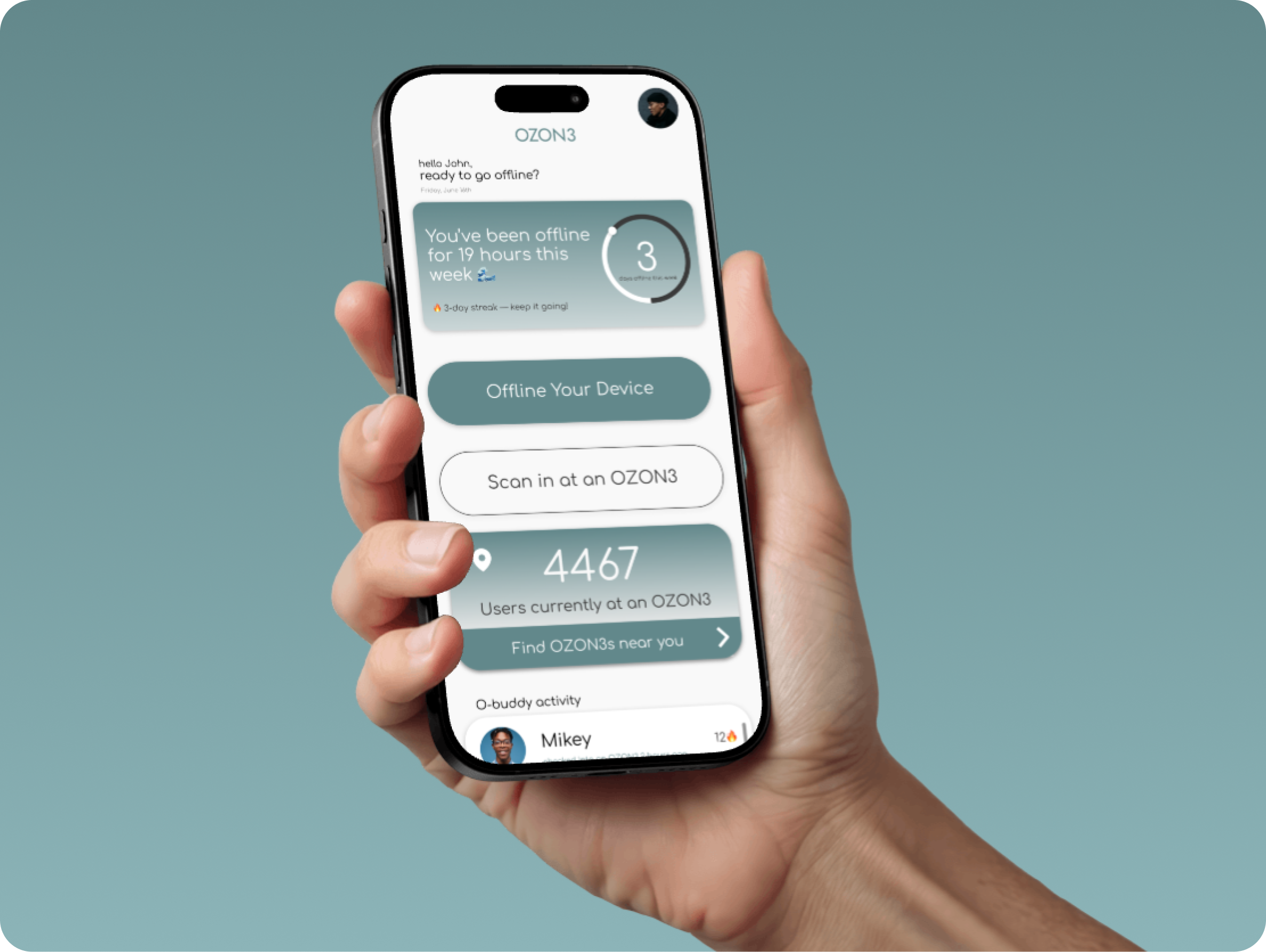
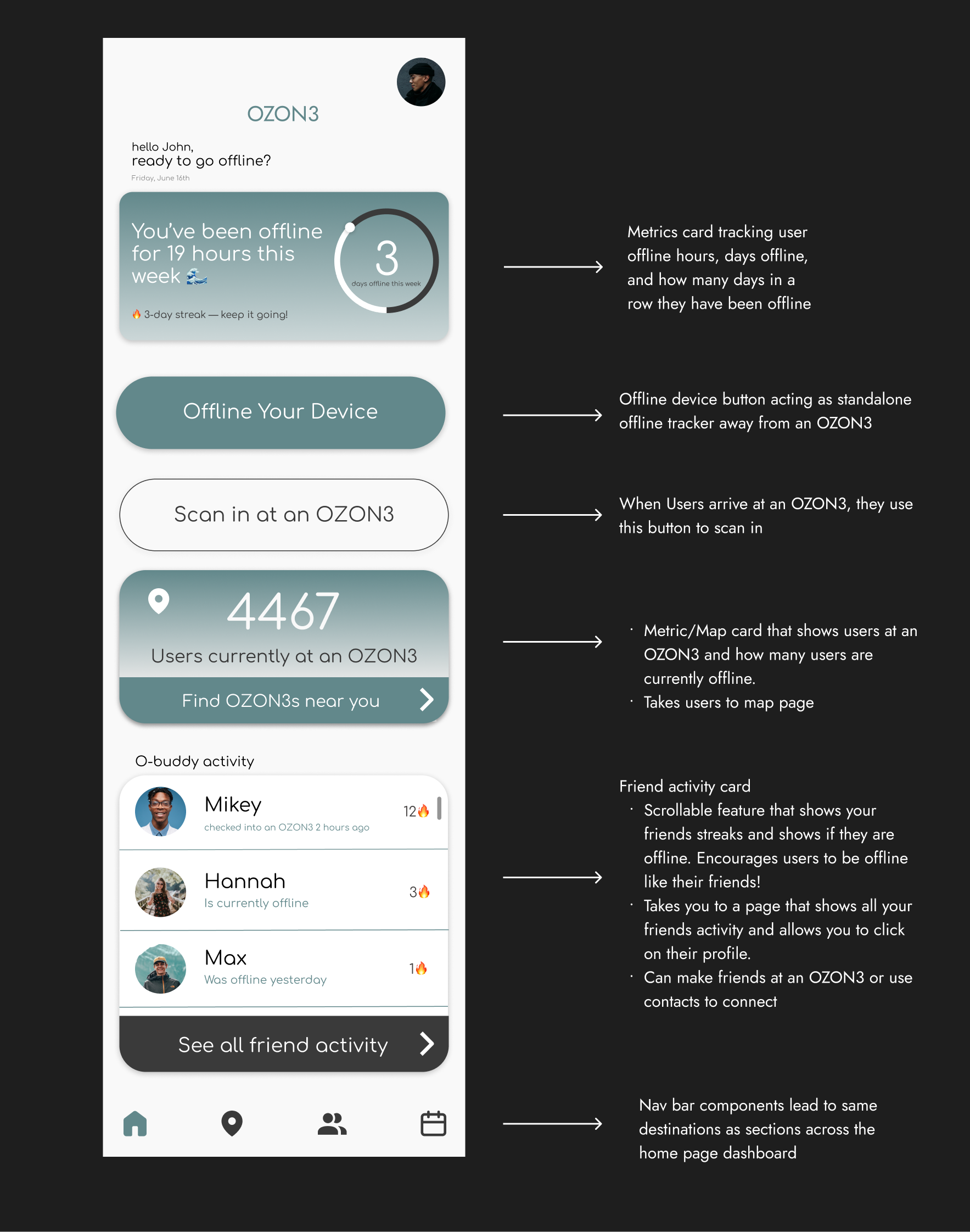
Behavioral Reinforcement: The metric card creates a positive feedback loop by quantifying offline time, rewarding user effort and reinforcing identity.
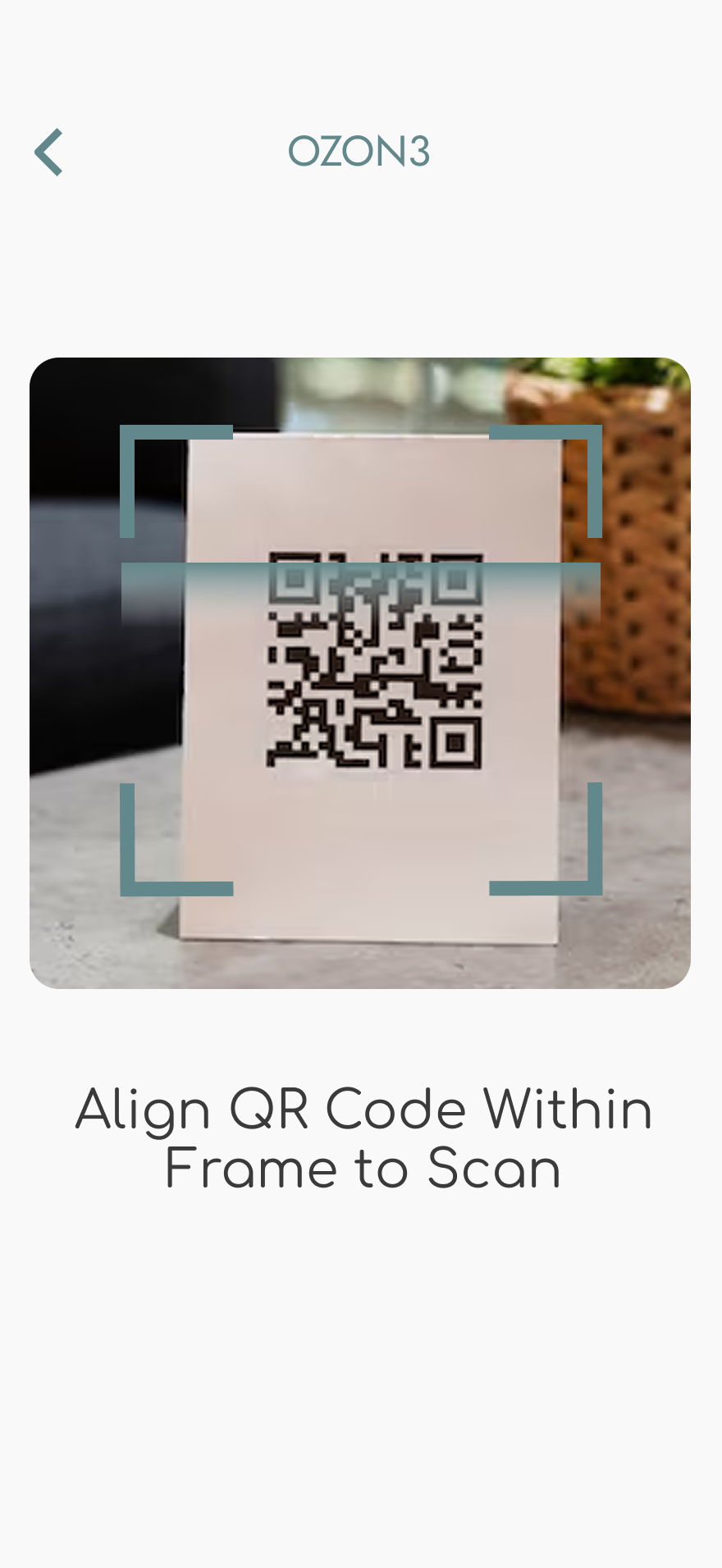
Navigational Efficiency: Stacking "Scan In" and "Offline" actions directly below progress data reduces cognitive load and builds muscle memory.
Minimal Friction: Organizing features into dedicated sections ensures a high-efficiency utility that minimizes screen time before entering the physical zone.
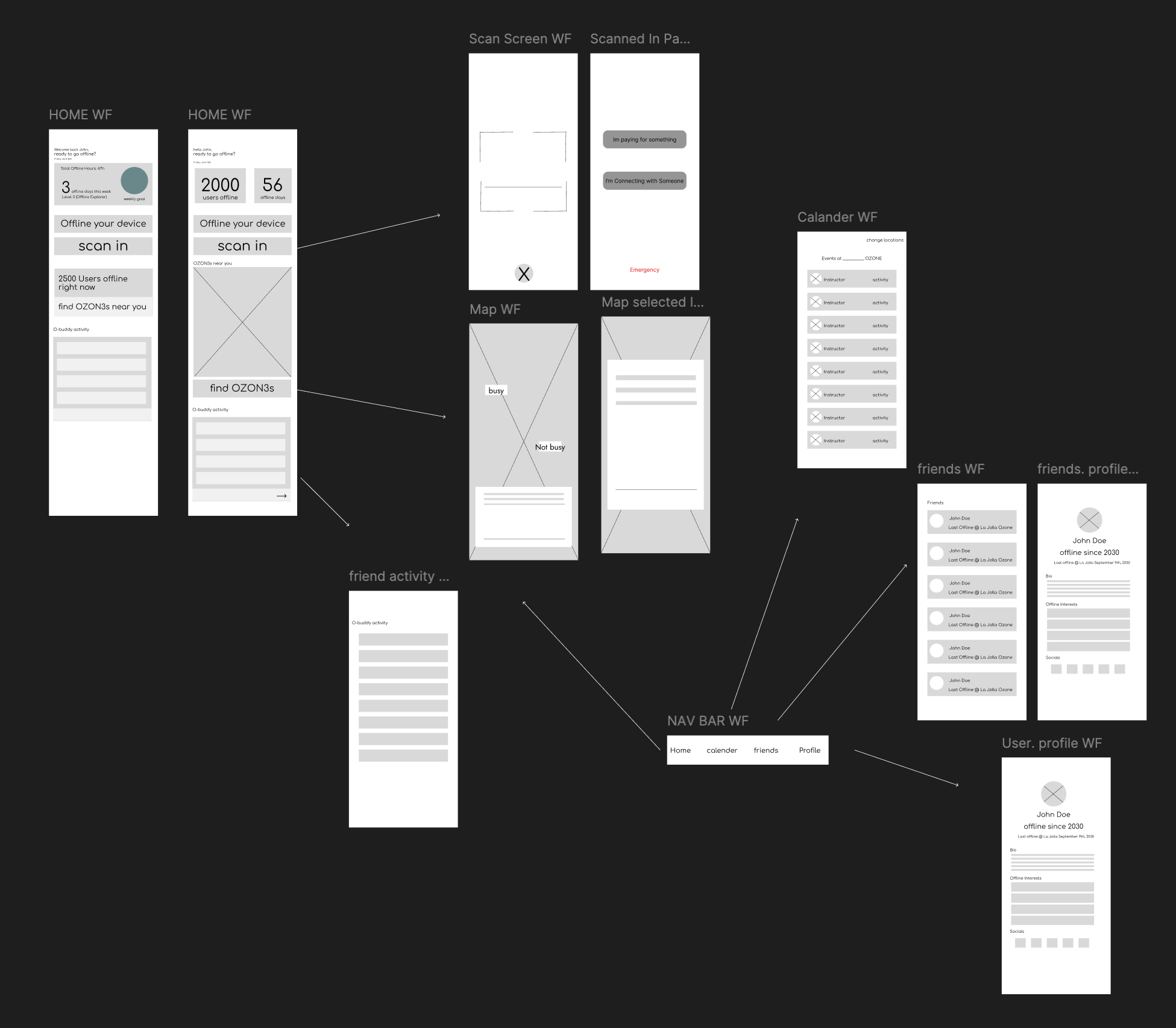
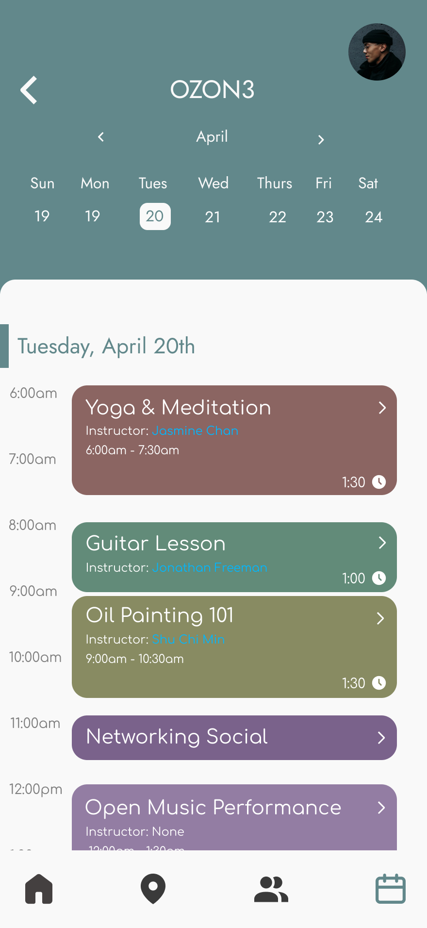
Wireframes and Planning
Low-fidelity wireframes translated the OZON3 concept into a simple, intentional user flow. The focus was reducing friction so users could quickly set offline time, discover locations, and view classes before disconnecting.
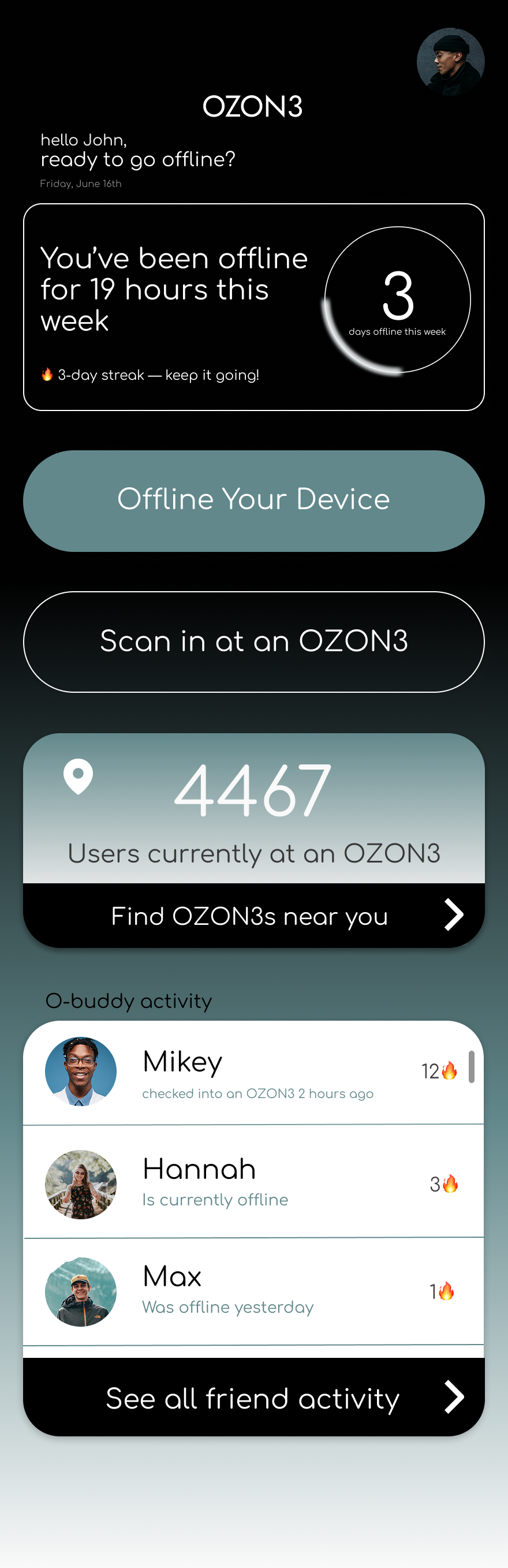
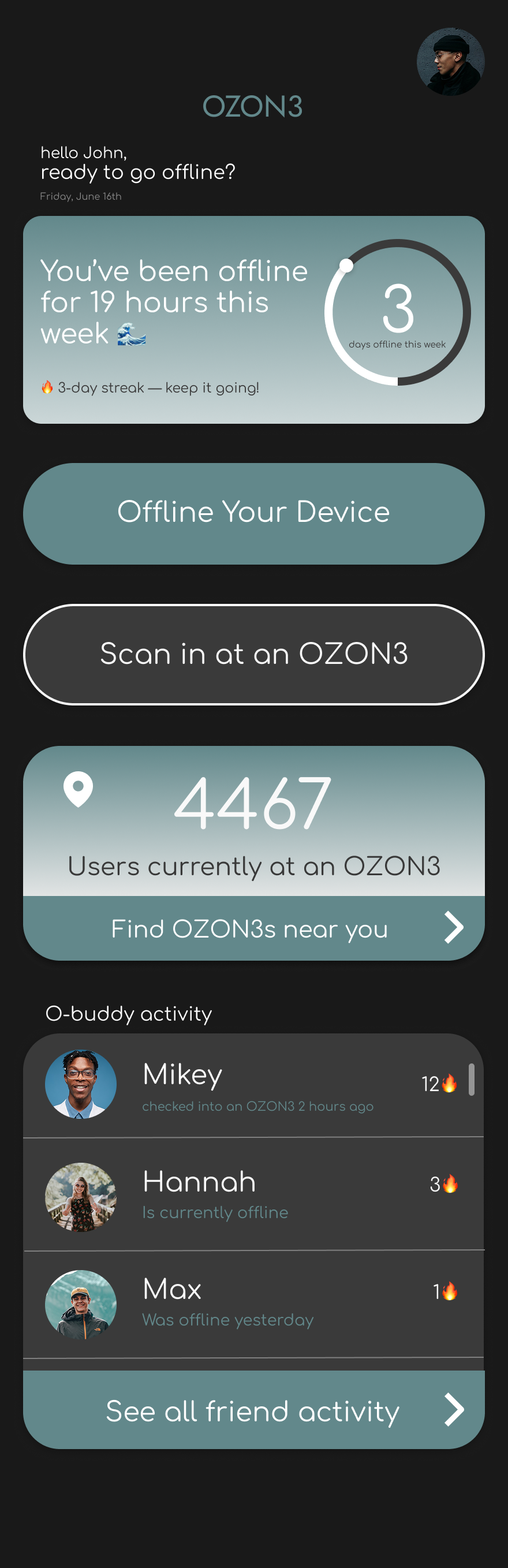
UI Iterations of Home Page
After establishing the mid-fidelity structure, I focused on the visual layer of the interface. I explored multiple UI iterations to test how the color palette interacted across backgrounds, buttons, and functional elements. These explorations helped refine contrast and color balance, leading to a final design that prioritizes legibility and a calm user experience.

Minimal Gradient
Dark Gradient
Dark Mode
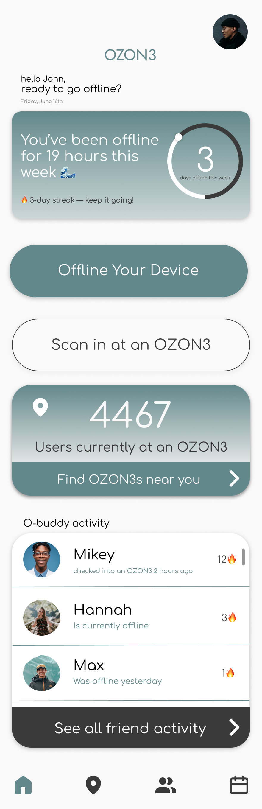
The final interface uses a clean, minimal aesthetic to prioritize clarity and calm, applying the 60/30/10 rule for a balanced color distribution:
Primary (60%): Off-White (#F9F9F9) A soft base that provides breathing room and reduces eye strain compared to pure white.
Secondary (30%): Muted Teal (#62888B) The signature brand color used for interactive elements and progress indicators to guide user habits.
Accent (10%): Deep Charcoal (#3A3A3A) Used for text and borders to provide architectural weight and high legibility.
I also retained subtle gradients on the cards to mirror the atmospheric lighting and glass textures of the physical OZON3 environments.
Final UI
High Fidelity System
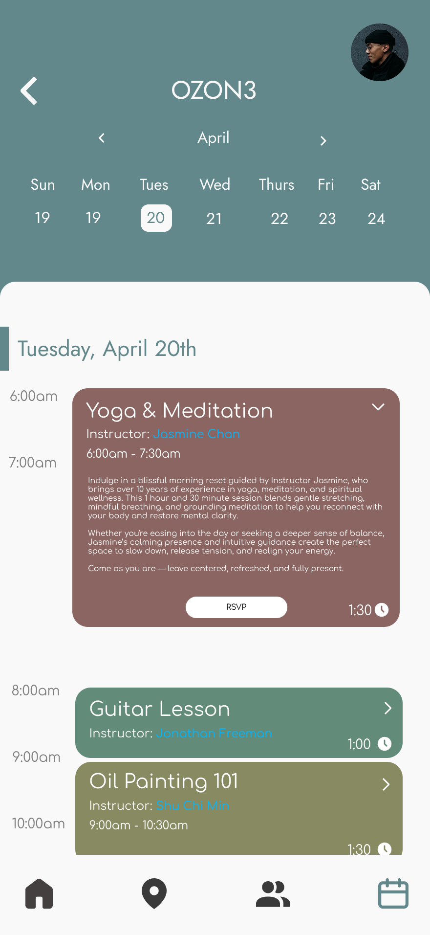
Home Page Dashboard
Location Interface
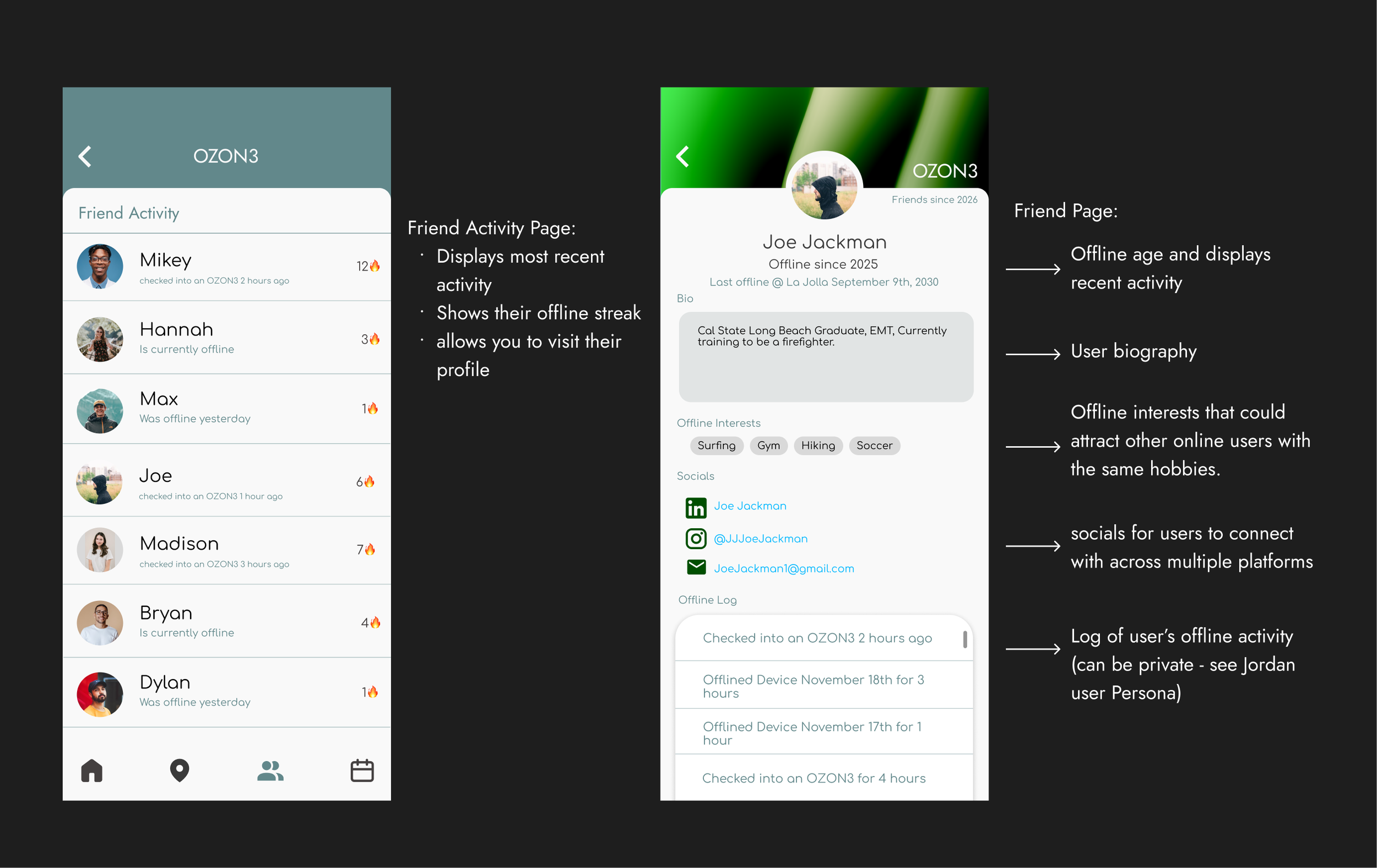
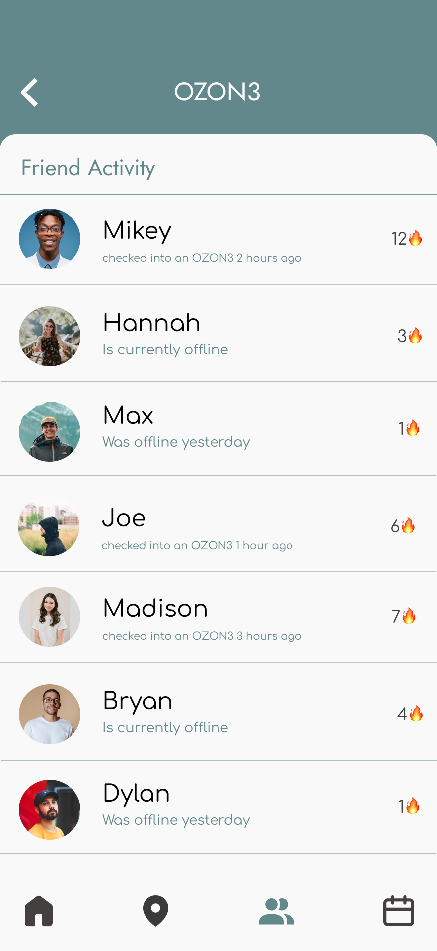
Community
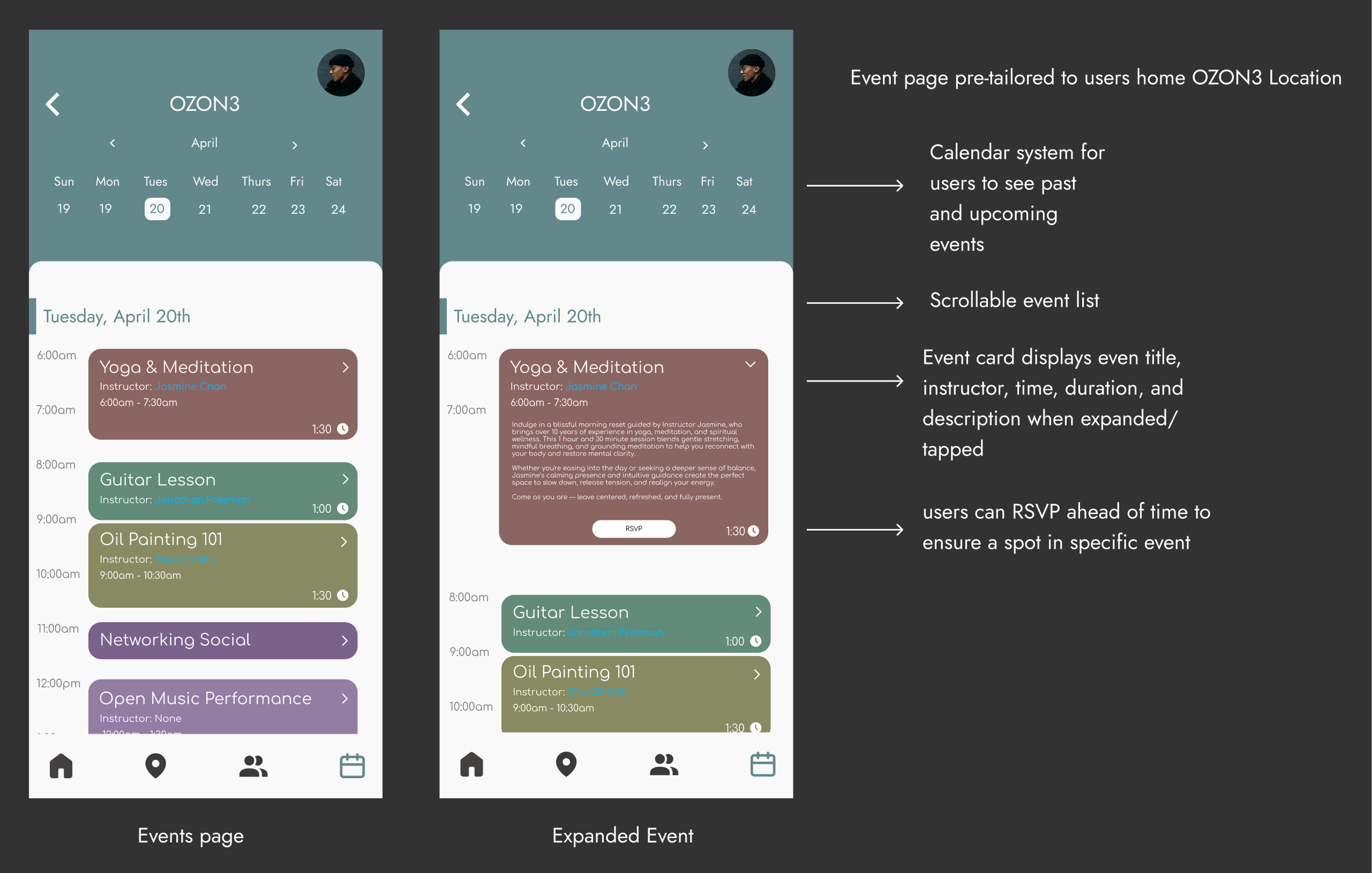
Events Page
Final Design Flow
Outcome + Reflection
OZON3 resulted in a speculative product that connects spatial design with a digital experience. I developed an architectural concept and built a full environment prototype in Unreal Engine to visualize how an offline-first space could function. In parallel, I designed a companion mobile app in Figma to support planning offline sessions, discovering locations, and navigating the experience.
The system reframes going offline as a positive action rather than a restriction. Users move from planning their session in the app to entering a phone-free environment, where cues like the phone screen fading reinforce the transition from digital to physical presence.
The Unreal prototype was presented during a class critique and received positive feedback from peers and faculty, who noted that the spatial simulation made the concept of digital disconnection feel tangible.
This project strengthened my ability to design across mediums, translating UX principles into both interface and spatial experiences.